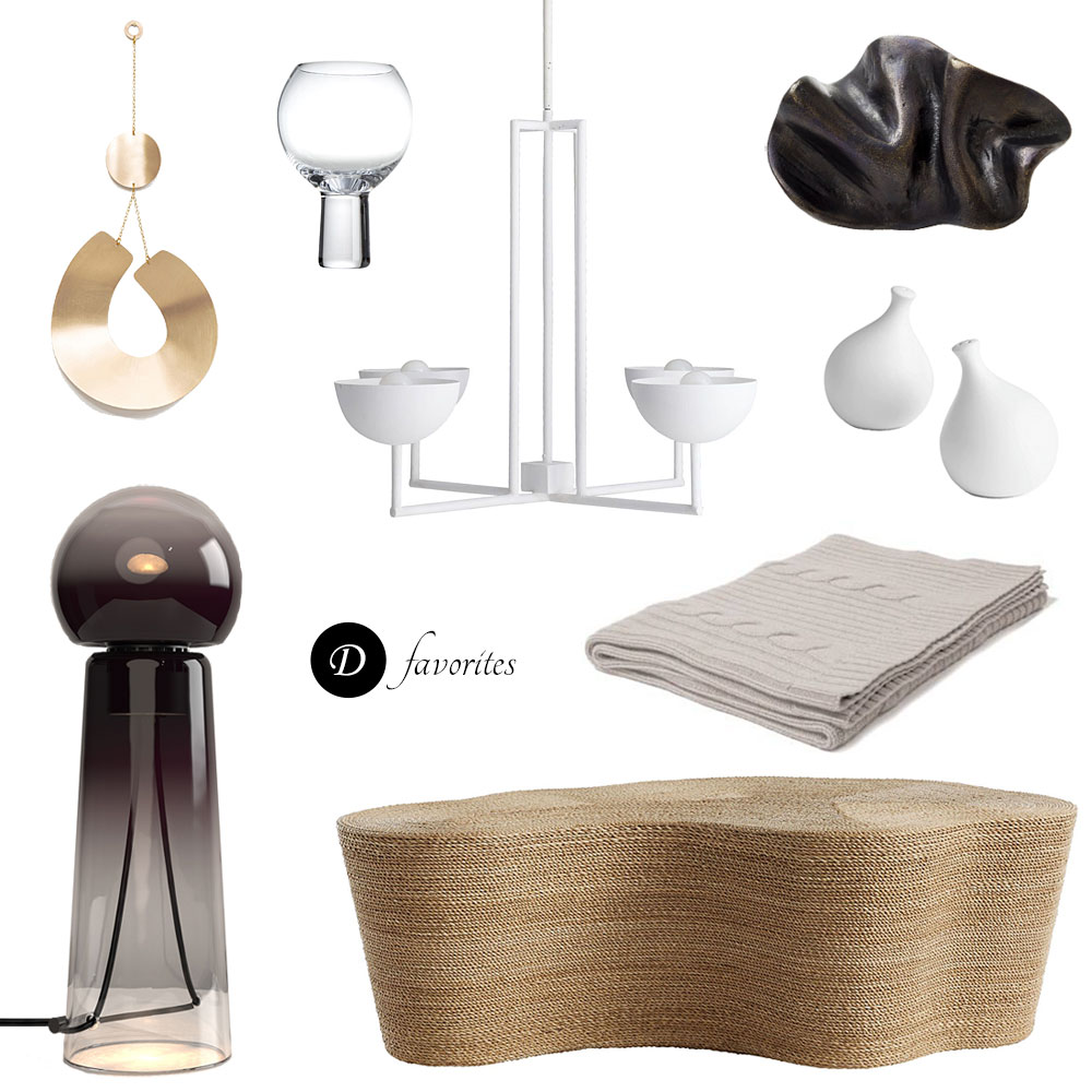
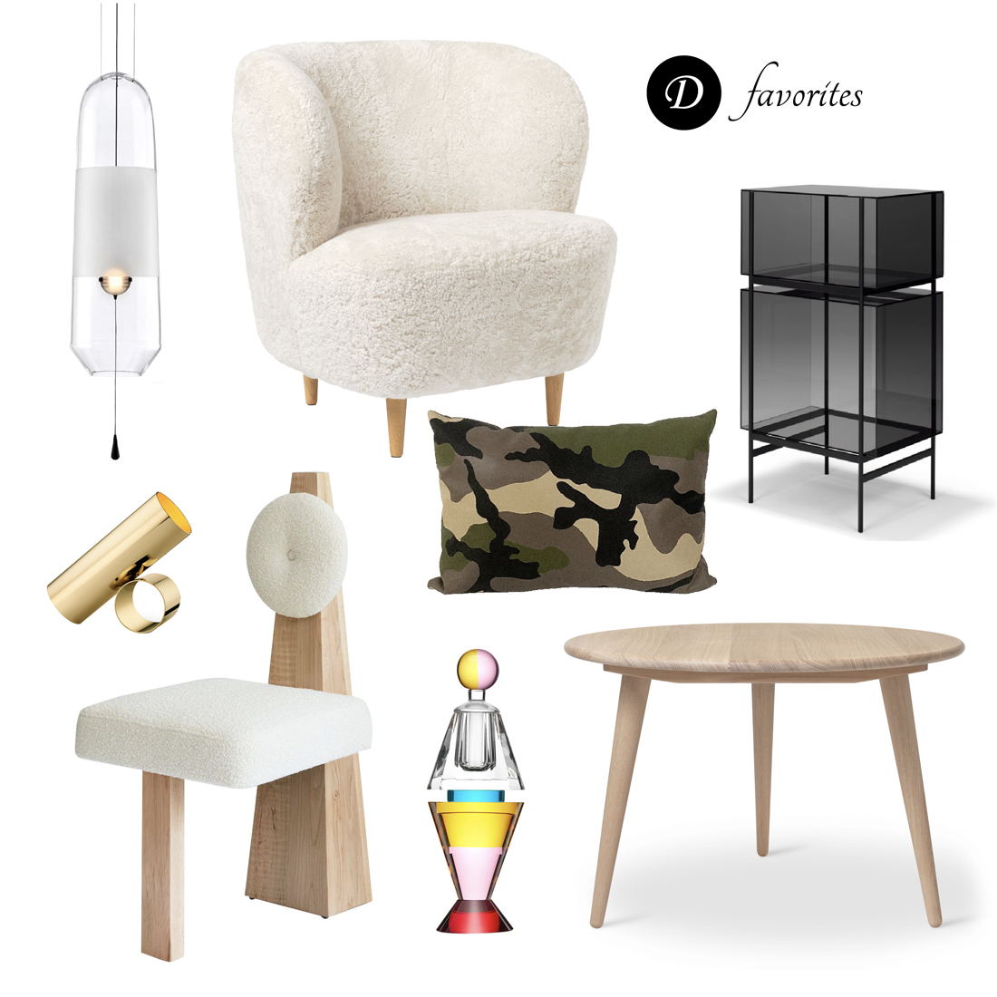
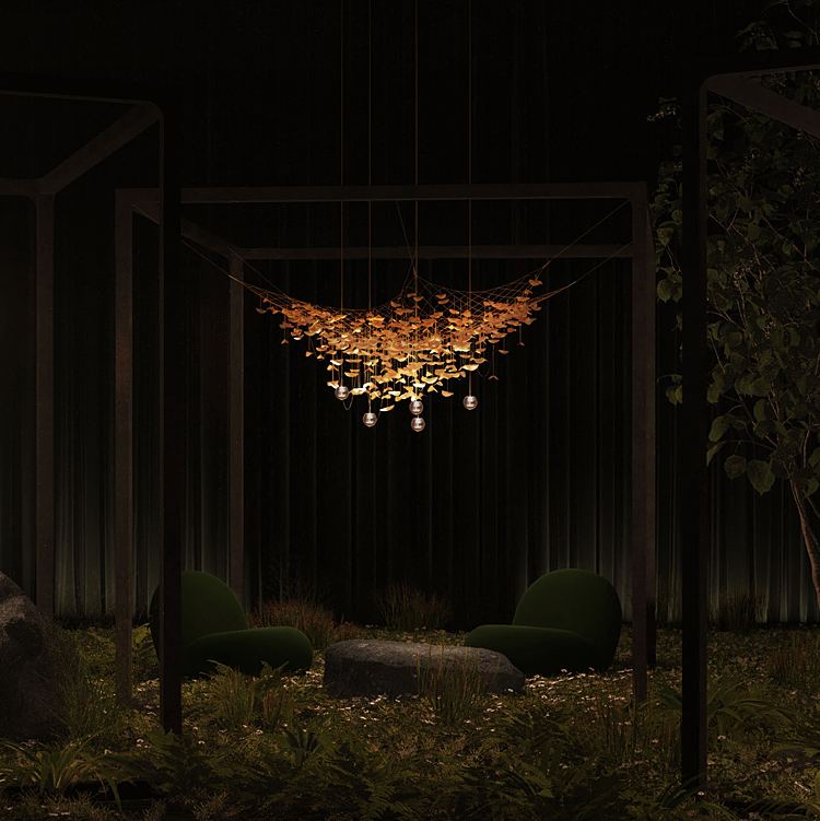
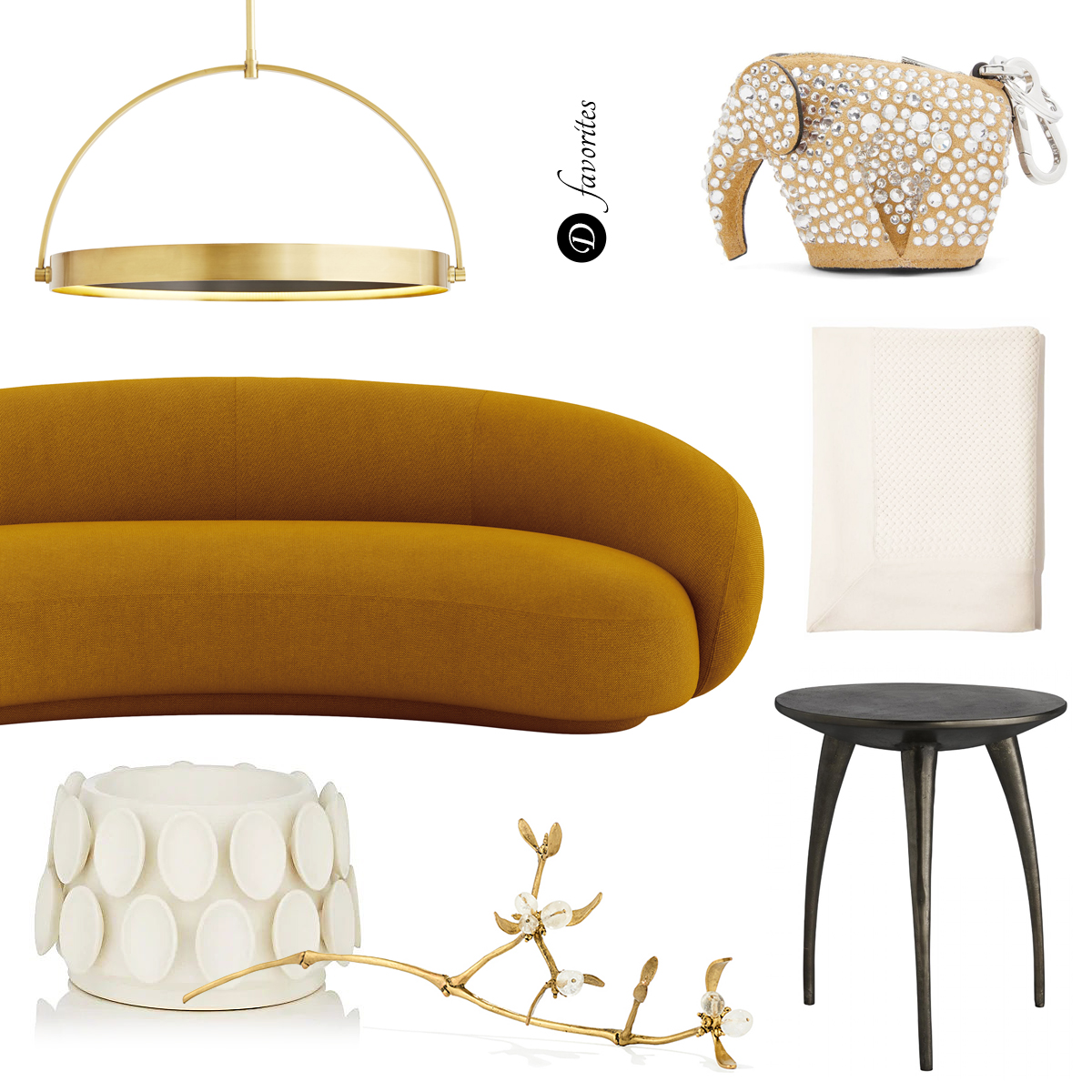
GUNS & ROSES: Sonia Rentsch’s botanical weaponry


Australia based designer Sonia Rentsch’s weltanschauung is to find the beauty in all things, and she does exactly that in her recent six piece series, Harm Less (2012). Clearly tapping into the spirit of our time, Rentsch has arranged entirely organic materials into images of botanical weaponry in a way that is as much striking in its beauty as it is in its underlying meaning. With bullets made of barely blooming buds and triggers made of brittle leaves and fragile plant tendrils – these small works of art force some big questions regarding man versus nature, life versus death… Beautiful.


Art direction by Olivia Nichols, Photography by Albert Comper.


RECLAIM x2: a NYC Design Week charity auction


Born in the wake of Hurricane Sandy, the grassroots design organization Reclaim NYC launched their inaugural event in December of 2012. The goal was to have designers transform wreckage from the storm into furniture and art to be auctioned for charity. The event not only raised money, but also bore some beautiful and unique pieces of work. This year, in the spirit of continuing the sense community generated by the first show, Reclaim has called upon the design community once again, this time asking designers such as Lindsey Adelman, Egg Collective and VOLK to partner with creatives from other firms, to produce works for Reclaim’s inaugural Design Week charity auction – Reclaim x2. The auction will take place on Thursday, May 16, 2013, 7:00 – 11:00 pm at 446 Broadway, 3rd Floor, New York, NY. All sale proceeds will go to the Brooklyn Recovery Fund for local Hurricane Sandy relief efforts.

Shown here is a sampling of some of the items that will be on action this Thursday, as well as some of the pieces created for the first event, which are currently available for purchase here.

Above - Blåst Tables by Marius Myking x Vidar Koksvik for Reclaim x2. A selection of candy colored mouth blown side tables. Available at auction this Thursday.


Poly by Egg Collective x Hangar Design Studios for Reclaim x2. A casting of a single shape that transforms when repositioned. Material options include plaster, satin bronze and etched bronze. Available at auction this Thursday.


High+Dry Table by Daniel Moyer for Reclaim NYC. A long legged table made of western red cedar recovered after Hurricane Sandy. The black paint symbolizes the flood line of the storm.


Big Bubble Chandelier by Souda x Sure We Can for Reclaim x2. Made from post-consumer PET bottles that have been cleaned, cut, and riveted together – the bottles are sourced from the homeless can collecting population in NYC through Sure We Can. Available at auction this Thursday.


Chainsaw Stool by Fort Standard for Reclaim NYC. Five wooden stools carved from fallen Hurricane Sandy trees. Each stool is painted and sealed in a unique color to emphasize its natural wood grain.


Large Stick Light by Lindsey Adelman for Reclaim NYC. A light fixture made from a reclaimed Cyprus branch.


Learn more about Reclaim NYC here. It is also possible to pre-shop the upcoming auction and/or shop items from Reclaim’s first event through Lin Morris here.

All photos via lin-morris.com and Reclaim NYC.


ERWIN OLAF IN THE HOUSE: 3 designers set his photos at home


The Amsterdam, Netherlands based photographer Erwin Olaf is perhaps best known for his unconventional, immaculate style, that never fails to to deliver a dramatic visual and emotional punch. Working both in film and photography, in commercial work and the fine arts – “Olaf’s trademark is to address social issues, taboos and bourgeois conventions within the framework of a highly stylized and cunning mode of imagery.” The result is a collection of work that seems to portray a hyper amplified, if at times unsettling, version of our recent and current history. Shown above – one of Olaf’s Hope Portraits, 2005 on display in The Novogratz’s home.


Royal Blood, 2000 by Erwin Olaf, in a Paris apartment designed by Pierre Yovanovitch.


With Olaf’s latest photography series, Berlin (2012), making a rather huge appearance at this year’s Milan Design Week, I thought it high time D pay Olaf and his work a little tribute. And what better way to do so, than to show how some of our favorite interior designers incorporate Olaf’s photography into their homes? How stunning is that first photo of the young woman? Above - People of the Labyrinths by Erwin Olaf in a bedroom designed by Remi Meijers.

Quote via erwinolaf.com. Photo # 1 by Emily Johnston Anderson.


IN A GALLERY NEAR YOU: fascinating look into a little seen world


It was early 2002 when Mike Brodie first heard of the time worn practice of train hopping – an American tradition of illegally jumping on and off freight trains to travel the country. Immediately enthralled by the idea, it was a matter of days before, at the tender age of 17, he jumped his first freight and a mere two weeks before he ‘was gone’ – disappearing into the vagabond lifestyle. In 2004 Brodie received a Polaroid camera, with which he began documenting his journey. He didn’t know it then but it would be four years, 7,000 pictures, 50,000 miles and 42 states before he would put down his then 35mm camera and hop from his last freight train.


In the meantime, he began posting his photos on various websites under the moniker “The Polaroid Kid”, offering the world an intimate glimpse into what was and is a gritty, sometimes frightening, sometimes beautiful, but always fascinating American subculture.


mike-brodie-dpages-blog-6
mike-brodie-dpages-blog-7


The final collection of photos – depicting filthy iron and steel trains rushing over gravel covered tracks, vast expanses of American countryside, fleeting personal moments, friends, relationships, places – have earned Brodie the prestigious Baum Award for American Emerging Artists (2008), two recent gallery shows (one in NYC and another running through May 11th in Los Angeles California), a hot off the presses book entitled A Period of Juvenile Prosperity, and a whole lot of recognition in the art and photography world. Success and accolades aside, Brodie says he never wanted to be an artist and has actually just completed two years of diesel mechanic school to enable him to work on the freight trains he grew to love so much. Mike Brodie’s photography may be purchased through the Yossi Milo Gallery in NYC and the M+B gallery in Los Angeles California.

Photos via Mike Brodie Photography and Yossi Milo Gallery.


WINES OF THE WORLD: some seriously lovable label design


wines-world-package-design-dpages-blog-3


Wine buying anxiety be gone! Call me unsophisticated or shallow but with packaging like this, price and quality concerns are almost out the window. After all, what host would not love to receive a bottle of wine as adorable as the ones shown here?


wines-world-package-design-dpages-blog-5


So how did all this wine label fantasticness come about? It all began a couple of years ago when the Belgium supermarket chain, Delhaize approached the multi award winning Lavernia & Cienfuegos Design firm with the task of creating labels for their “365″ brand of wines.  The primary goal – to create a simple and unified look for the affordable ”365″ brand while imbuing it with a sense of humor. With thoughts of an everyday wine in mind, the designers chose an ingenious if not obvious muse – the ordinary cork which they then whittled and dressed according to each wines location of origin. The result – Chilean corks carved into miniature moai, Californian corks transformed into noble Native Americans and free wheeling cowboys, French corks designed to don tiny Napoleon hats, berets and so on.

Job well done Lavernia & Cienfuegos! Click here for a Delhaize location near you. Now I’m off to see if it’s possible to get my hands on some of these bottles.

Images courtesy of Lavernia & Cienfuegos Design. 


NAO TAMURA’S FLOW(T): a Venice inspired light fixture


The Milan Design Week 2013 goodies keep rolling in and this may be one of my favorites yet. Flow(t), designed by Nao Tamura, is a contemporary chandelier composed of blown glass lights bearing shapes reminiscent of nautical buoys. The designer describes her inspiration for the light as follows, “The reflections of the Venetian cityscape glistening on the evening water hints at an imaginary city below the moving surface. There is a border between the world under and the land above. In the city of Venice, where the real world and fantasy coexists, this chandelier is the embodiment of the beauty of dual worlds.”


Flow(t) was made for, and is available through, the London and Venice base company Wonderglass.

Photos courtesy of Nao Tamura.

UPDATE ON KREOO: ‘halfway between minimalism and sculpture’


Today we are revisiting an old D favorite – the bath, living, and garden furniture company Kreoo. For those not in the know, Kreoo is the three year old offshoot of the Italian marble company Decormarmi, and its line of sinks, tiles, shelving, tables and seating are the vision of talented Venice based designer, Enzo Berti. DPAGES covered the initial line and interviewed Berti back in 2011, but since then the collection has grown and it is definitely worthy of a share. Below are a few new favorites. Enjoy!


Wood Box – a line of modular wood based and marble topped furniture.


Loto – a thoroughly contemporary sink based on the legged sinks of decades past.


The sink is available in four marble options and the wood ‘easel’, made of larch wood, is available in four different finishes.


Designed in 360°, Loto is fit for center of the room installation (i.e. no need to hide the back).


Mixing and matching – the marble sink portion of Loto, shown resting on the Wood Box base.


Shiro – modular larch wood and marble shelving.


Rondo’ – bas-relief marble cladding


Hana – wall and floor covering, inspired by old wood parquet. Available in a variety of marbles. Love the delicate chevron pattern!


Cashmere – the newest sink in Kreoo’s collection.


Pavè Drink – smooth marble stones topped with larch wood table tops. This would make for some incredible garden furniture/sculpture.


Pavè Log – smooth marble bases support larch wood beams to form sculptural benches.


To view more of Kreoo’s uniquely beautiful line of furnishings and get to know the designer behind it all, I invite you to click through to DPAGES’ Initial coverage on Enzo Berti and his debut line for Kreoo.

Photos via kreoo.com.