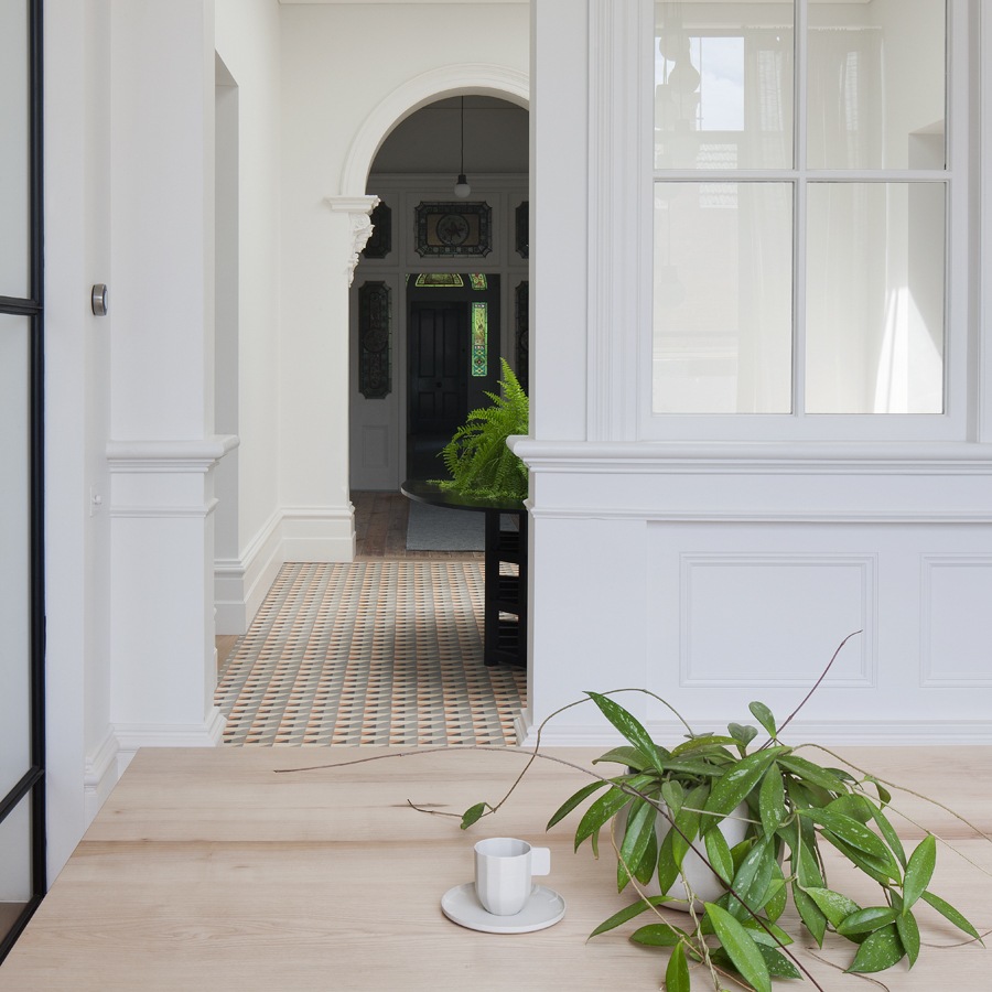
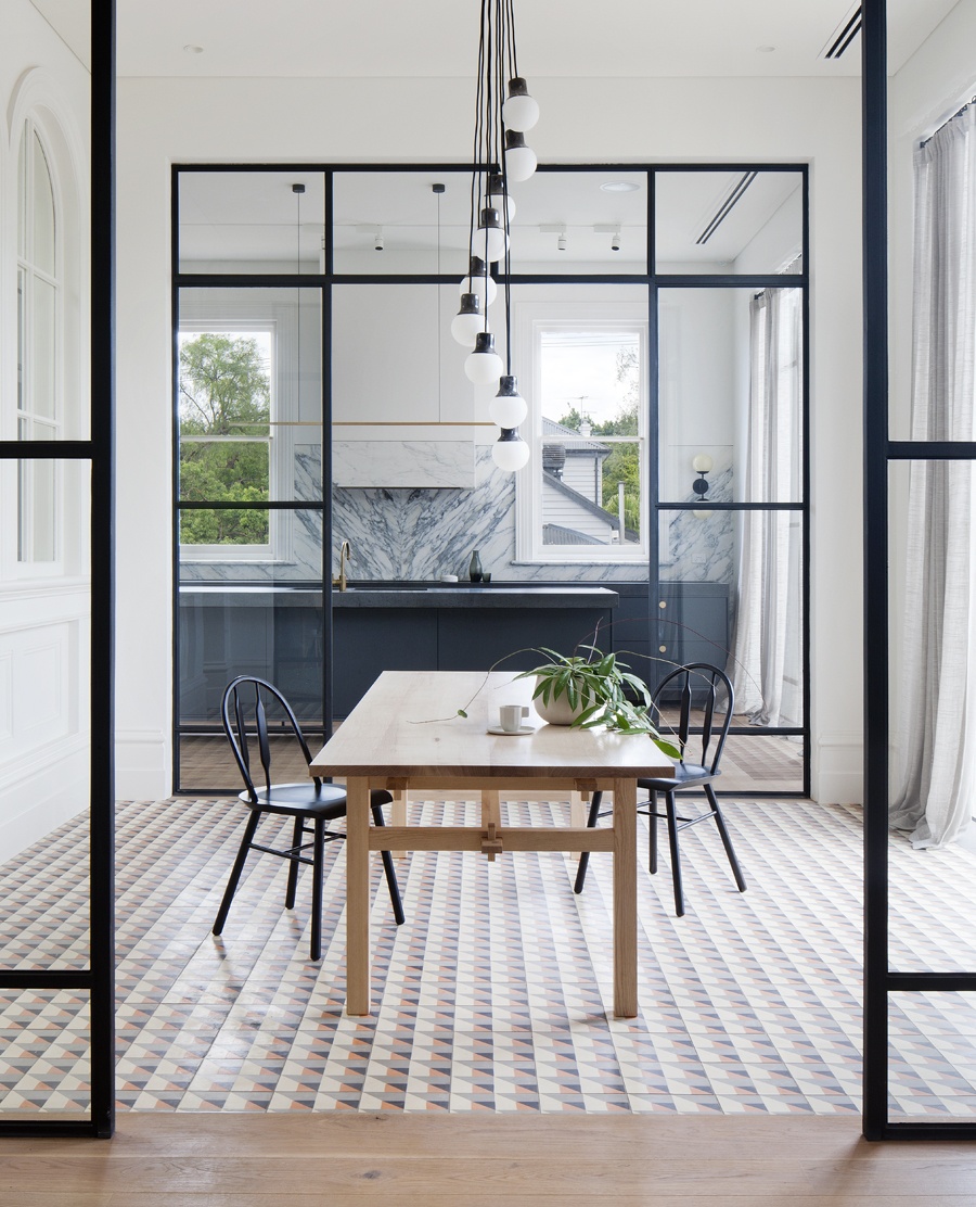
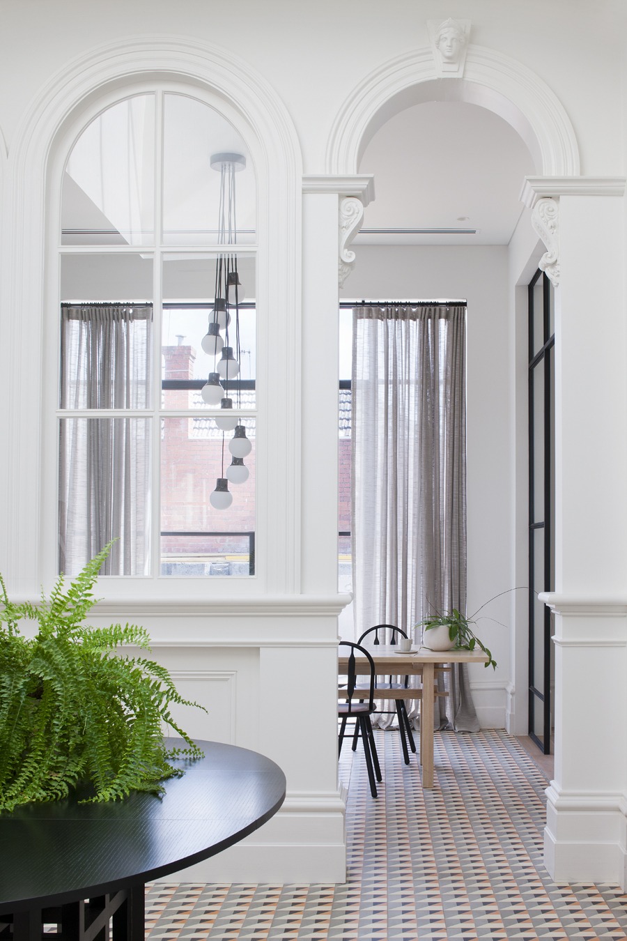
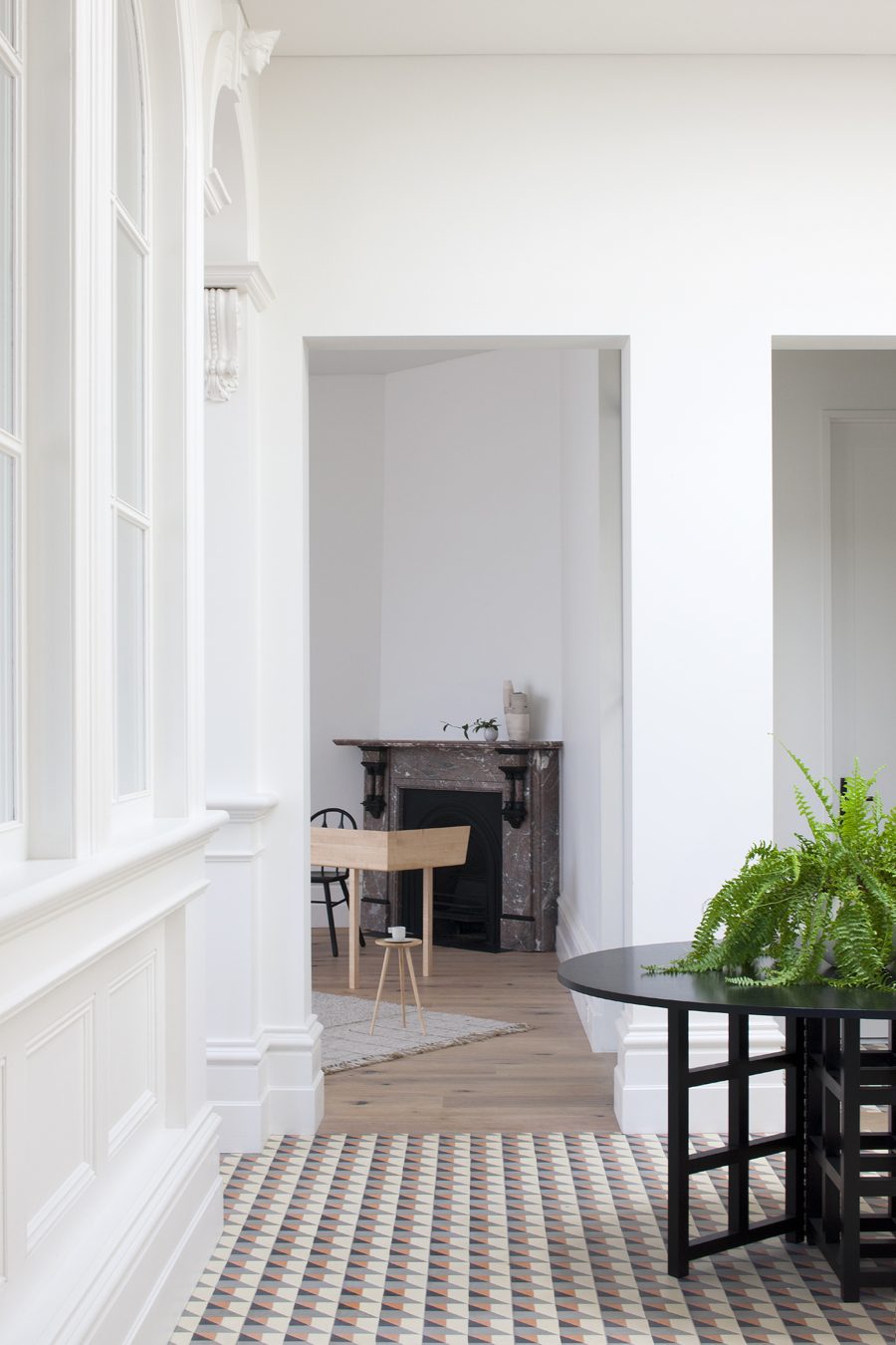
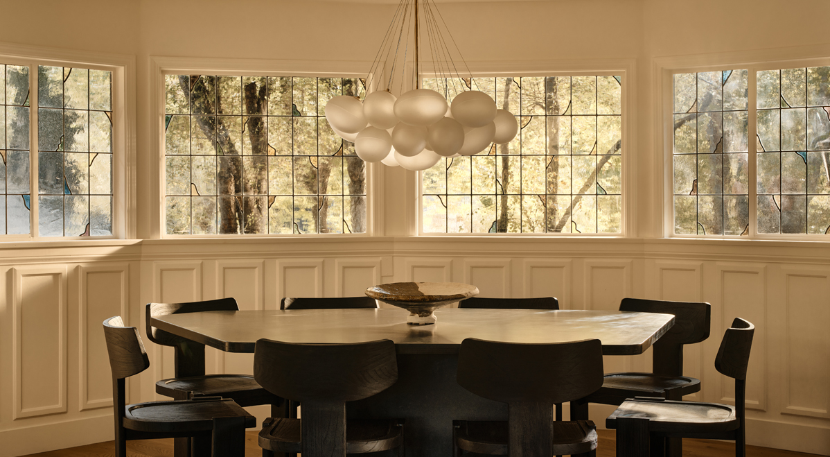
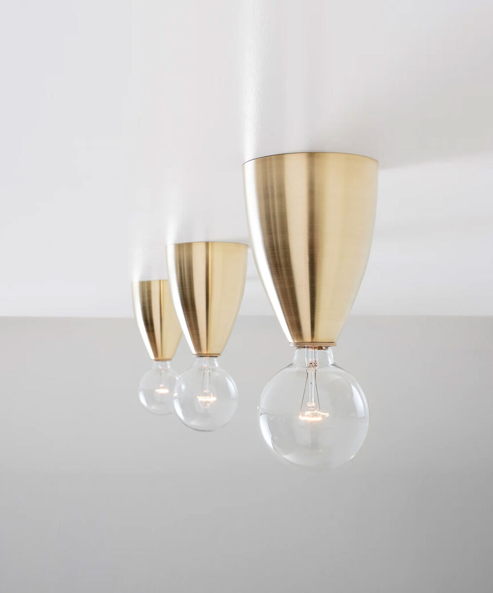
Australia based design firm Hecker Guthrie has recently returned a men’s retirement home to its former glory as a beautiful family home. The Victorian gem had suffered a variety of indignities over the years including the addition of false ceilings, wall to wall red carpeting, and a general dicing up of the original floor plan. Photography by Shannon McGrath.
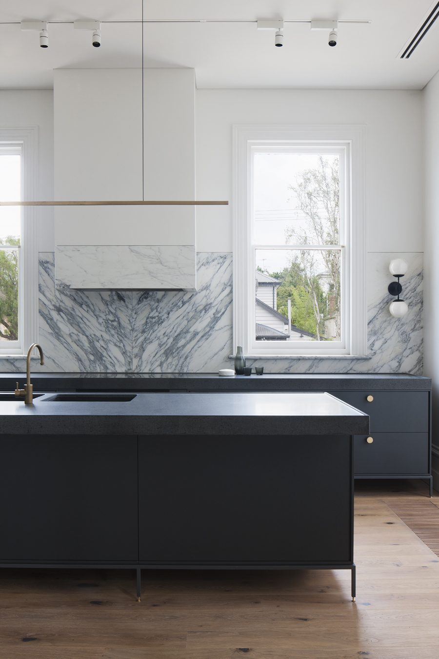 |
THE ANTIDOTE…to the structure’s design malaise was a cleaning up of a 1960s addition and stripping back of the main home. From there, the design team rebuilt and restored the original baltic pine floors, moldings, ceiling roses, and stained glass windows. |
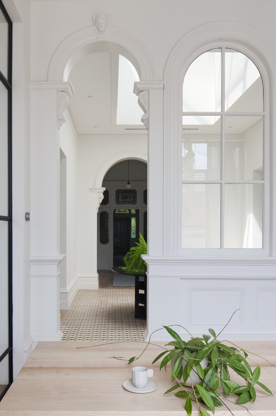 |
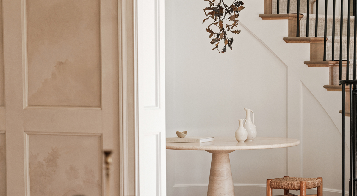
THE ATRIUM…was re-designed as the heart of the home – with the new skylight, creating the feel of a modern day sunroom. |
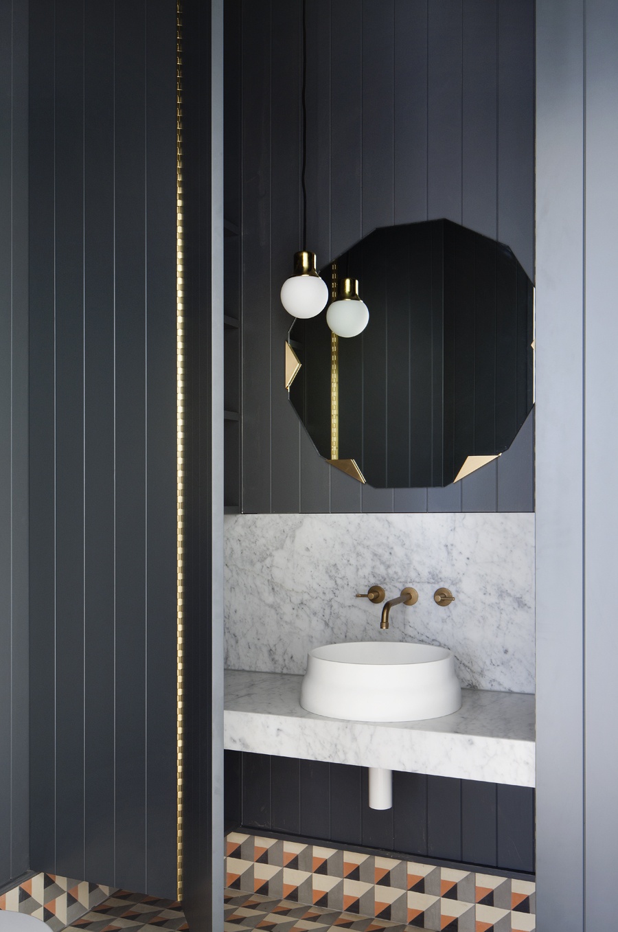 |
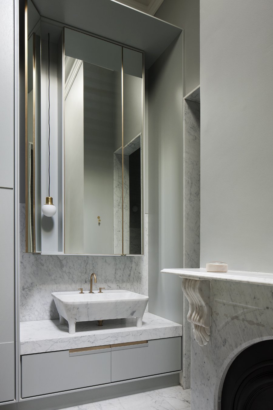
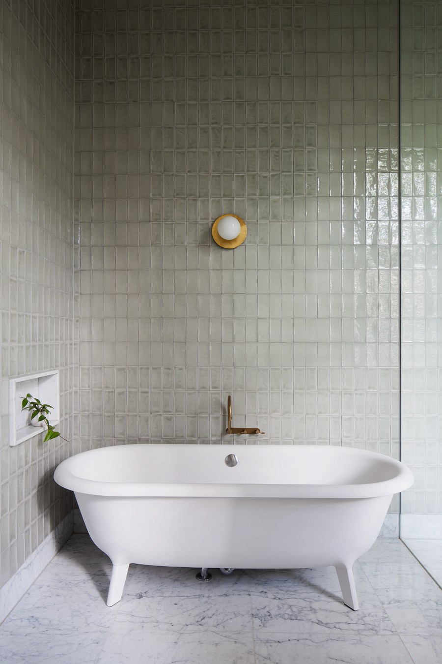
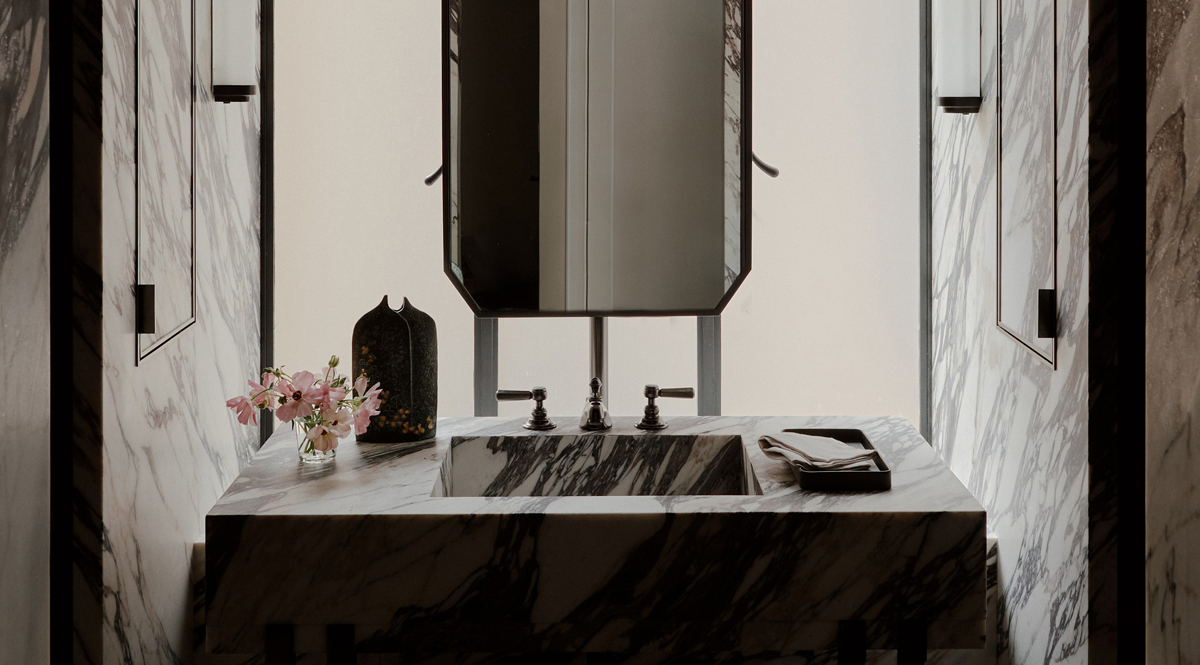
BEHIND CLOSED DOORS…the bathrooms were designed with an added dose of whimsy and drama. |
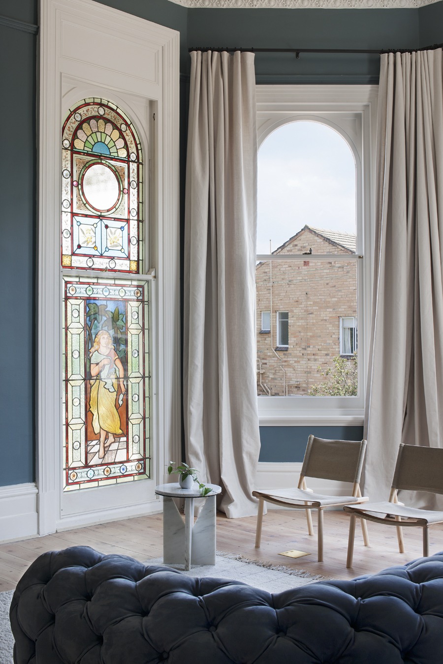 |
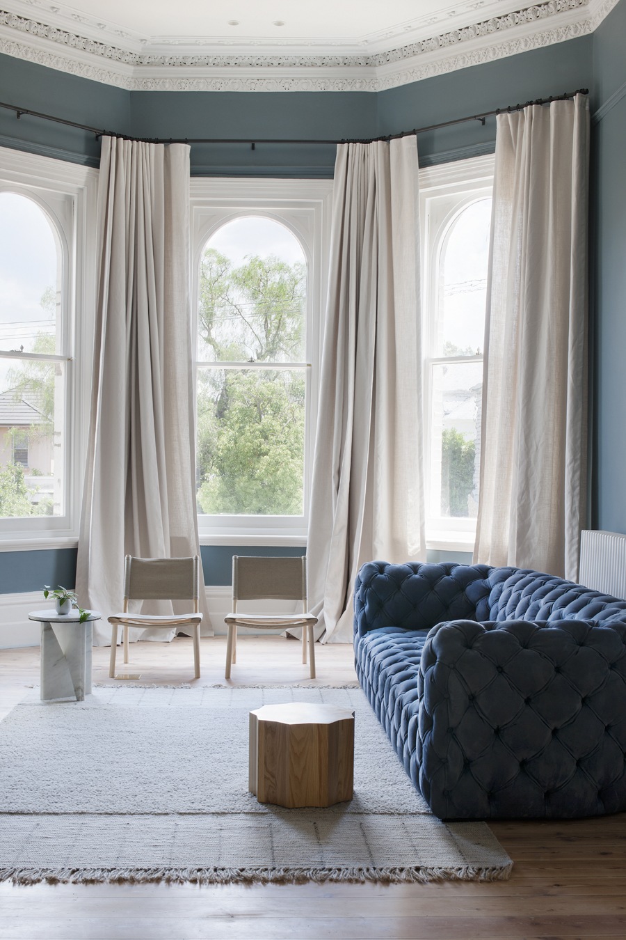
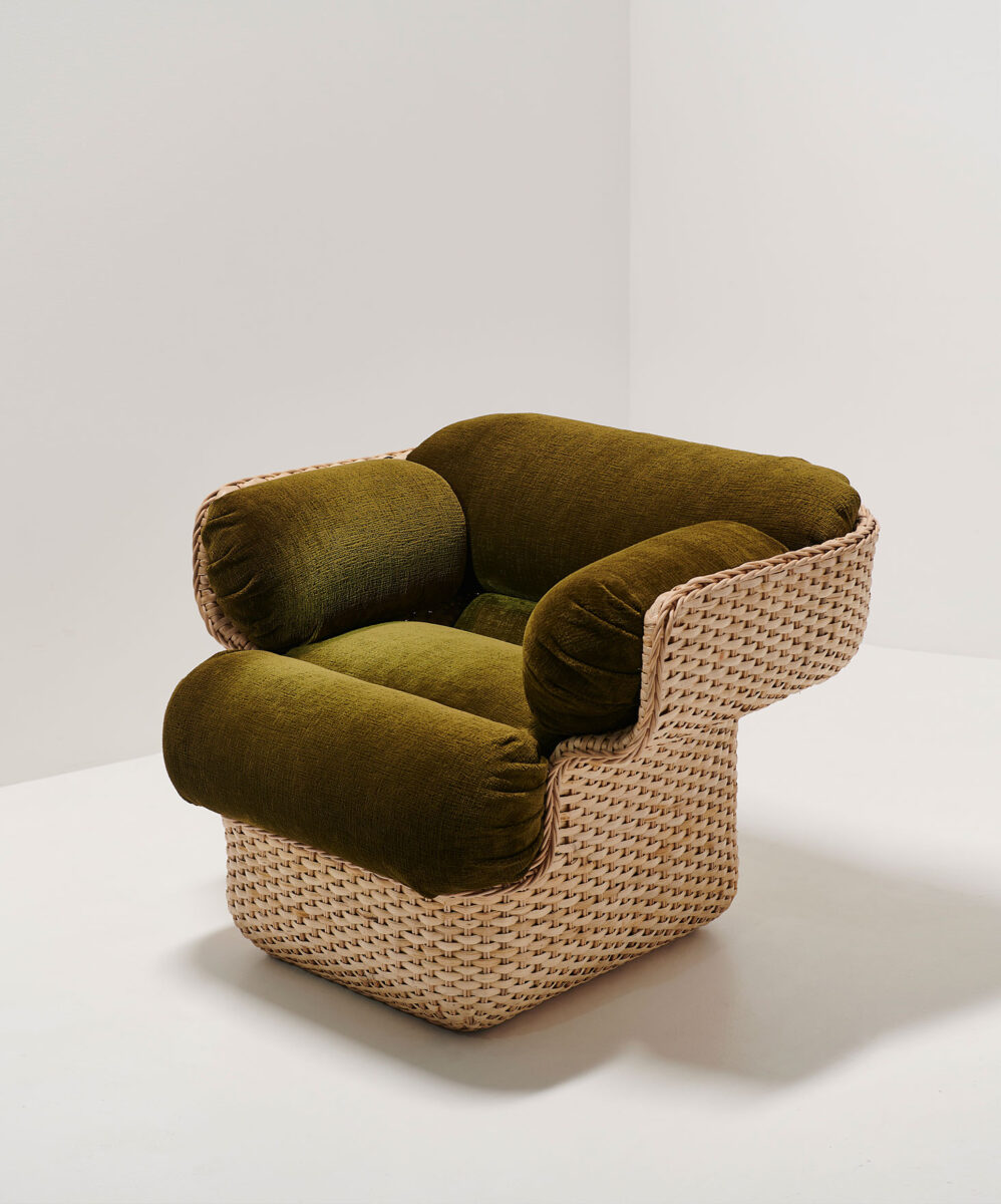
THE LIVING ROOM…features traditional detailing set against simple contemporary furnishings. |
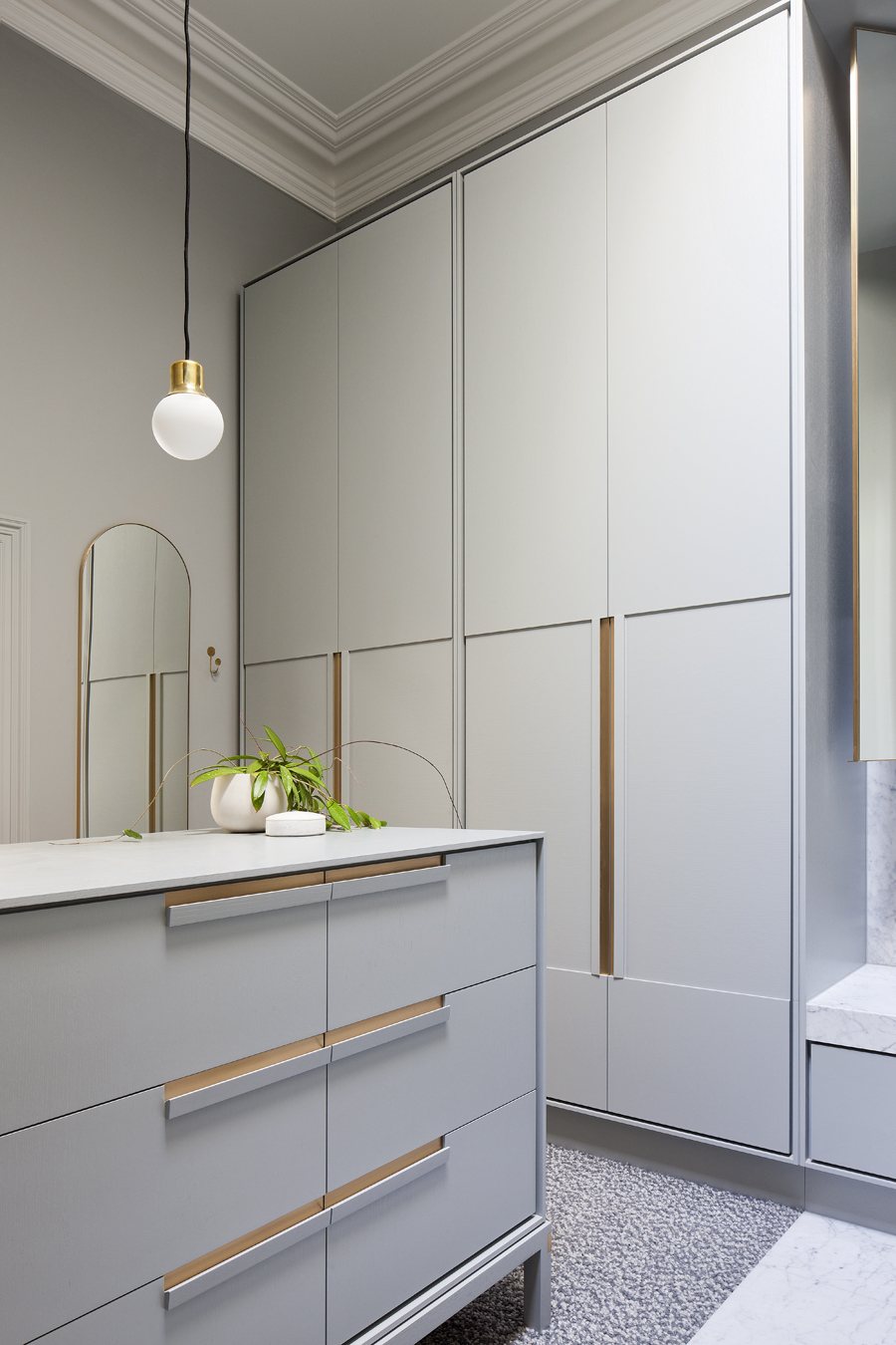 |
A COHESIVE…color scheme was used throughout to ensure a seamless flow from space to space. In contrast, differences in period detailing were emphazised – celebrating victorian flourishes in the main home and a more contemporary simplicity in the 60’s addition. |
DPAGES TAKE…
1. Brass Pendant Light
2. Spindle Back Chair
3. Cement Tile
4. Two Arm Sconce
5. Brass Hardware Handles
6. Marble Sink
7. Marble Stool / Side Table
8. Tufted Sofa
9. Sculptural Wood Side Table
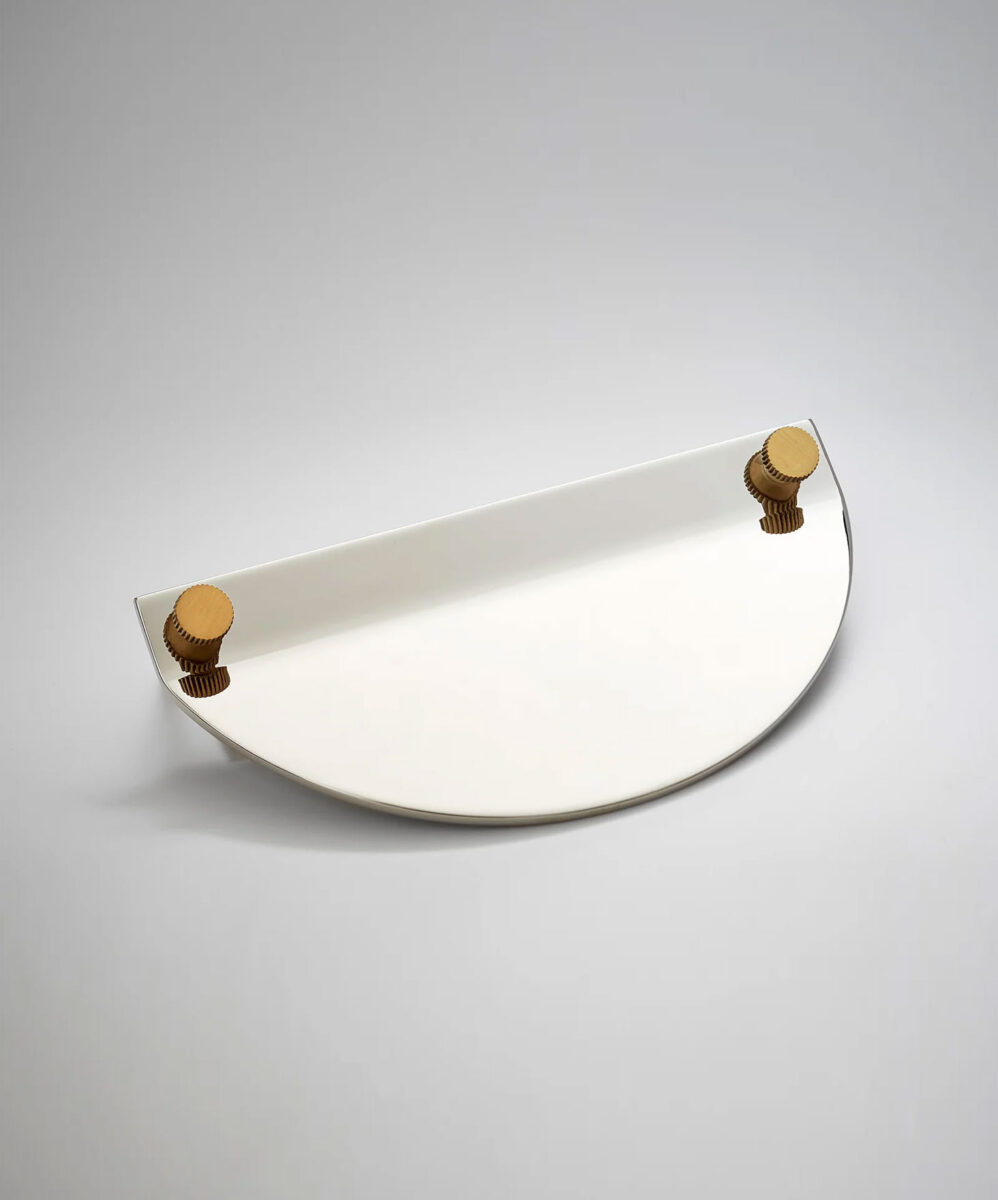
10. Brass Accented Mirror


