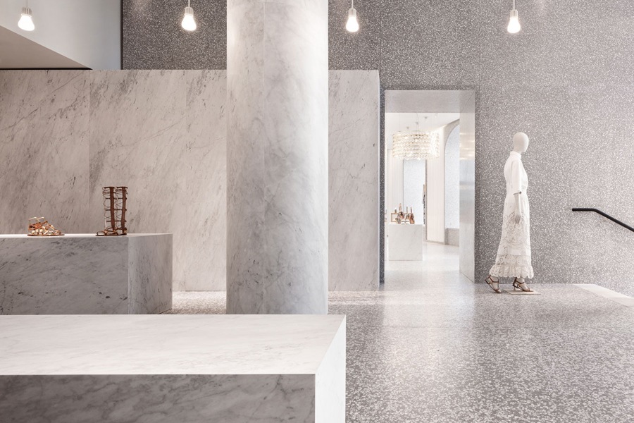
Spanning the length of several interconnected buildings across Piazza di Spagna and Piazza Mignanelli lies David Chipperfield’s unique vision for Valentino’s Rome flagship store. The 1,820 square meter destination was designed in collaboration with Valentino’s creative directors Maria Grazia Chiuri and Pierpaolo Piccioli to uphold the original store’s concept of combining old and new via the use of solid and luxurious materials. The results are nothing short of otherworldly.
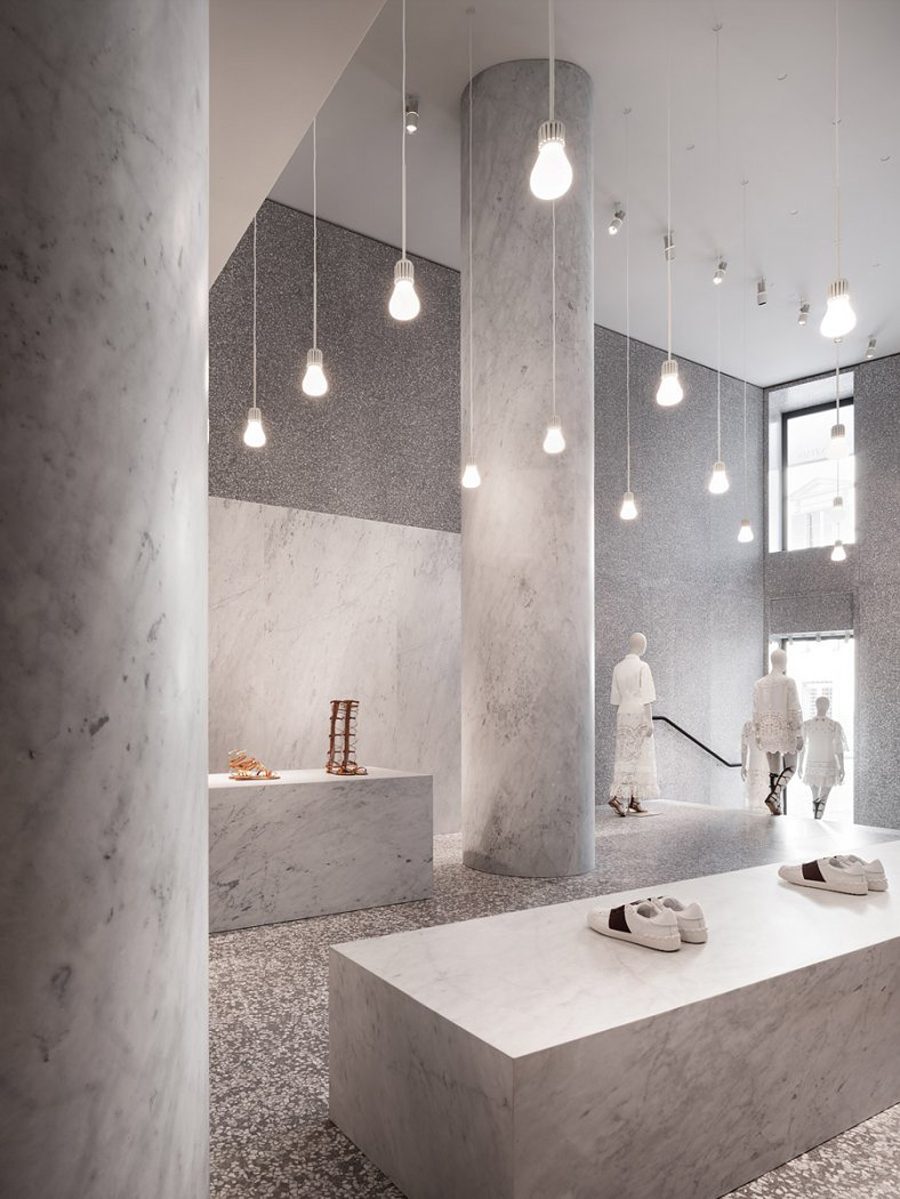 |
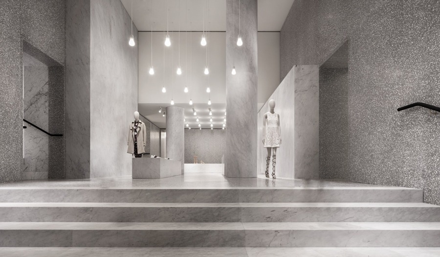
UPON ENTRY…guests are greeted by a grand atrium complete with ceremonial-style stairs and monumental columns. |
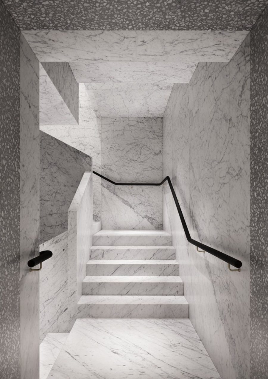 |
JUST OFF…the main entry lie two staircases, each clad in near seamless marble and providing access to the upper levels of the store. |
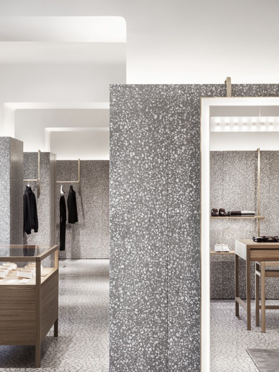 |
DESIGNED…first and foremost as a showcase for the merchandise, the team opted for simple architectural forms rendered in undulating shades of grey. |
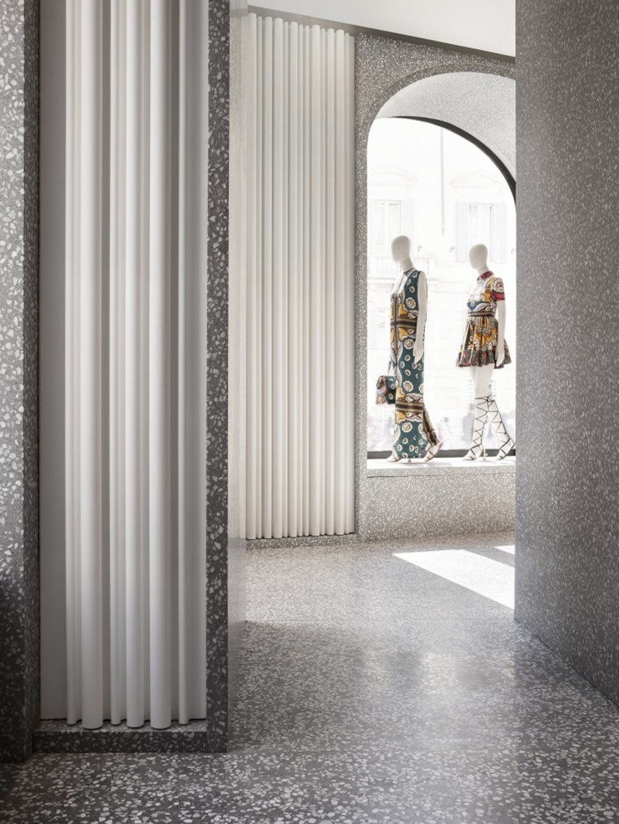 |
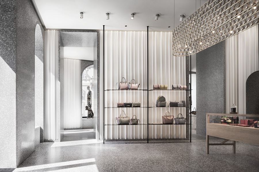
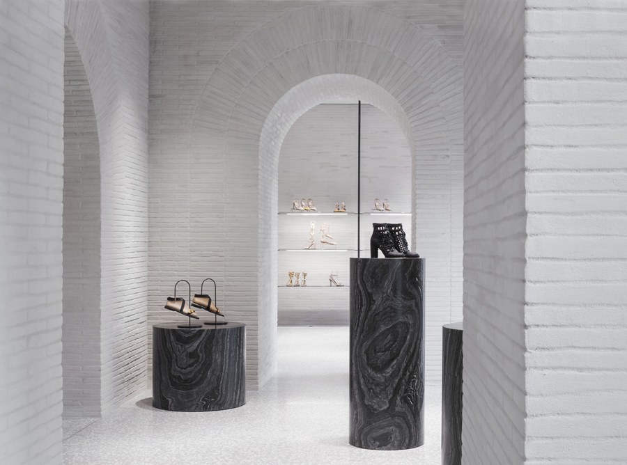
THE RESTRAINED…material palette of plaster, brass, timber, carrara and Venetian terrazzo furthers the serene atmosphere – providing each shoe, purse and dress its own space to shine. |
 |
WHILE THE NEW…flagship enjoys harmonious flow from one space to the next, each room was designed with a distinctive character boasting its own customized palette of texture, color, and light. |
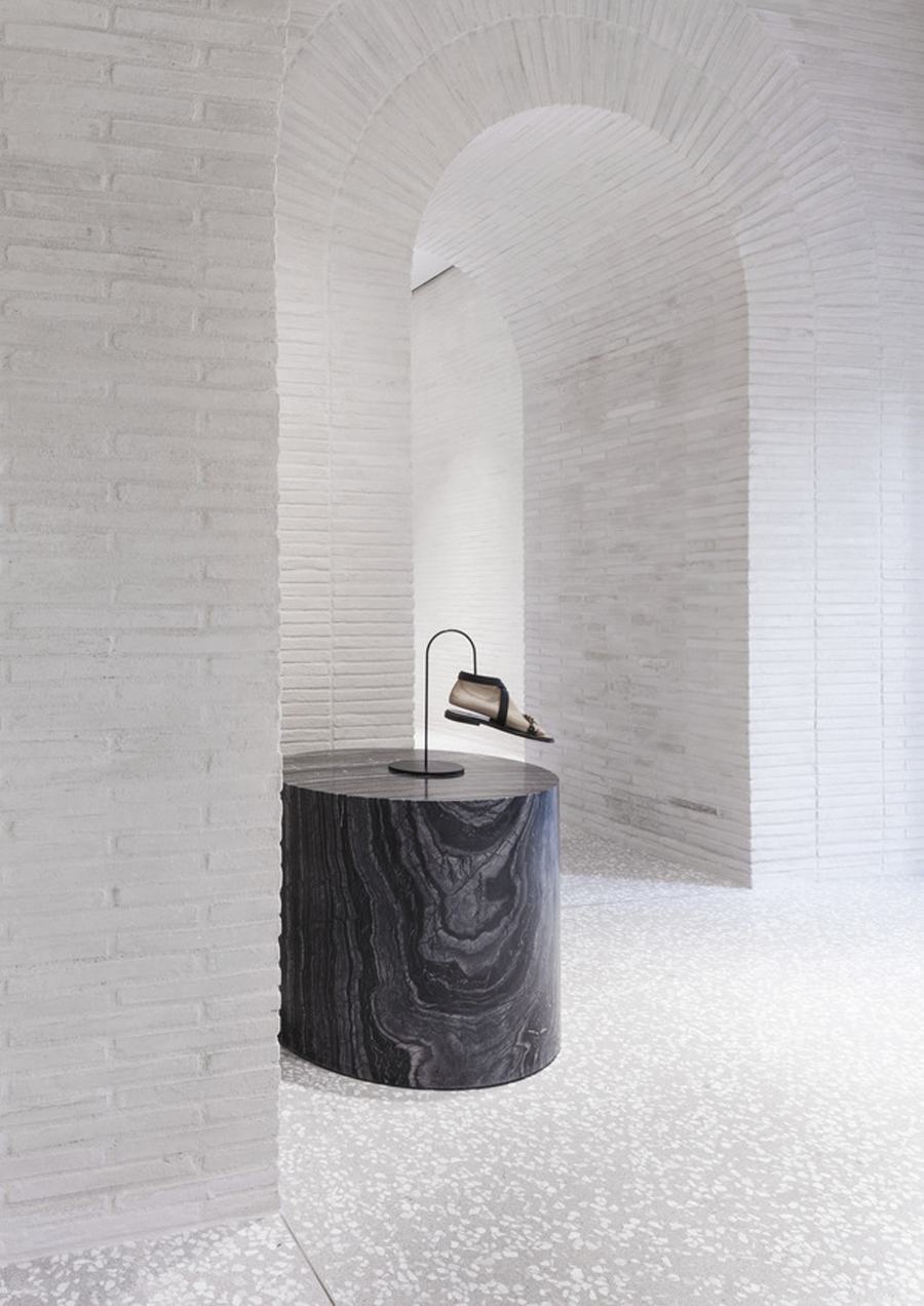 |
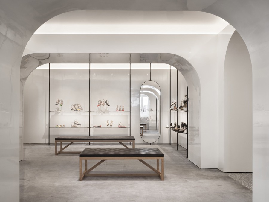
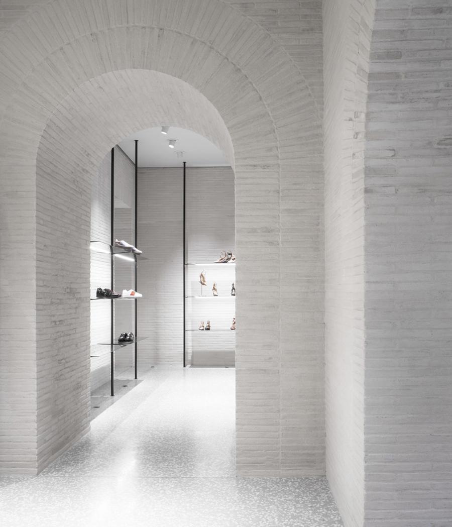
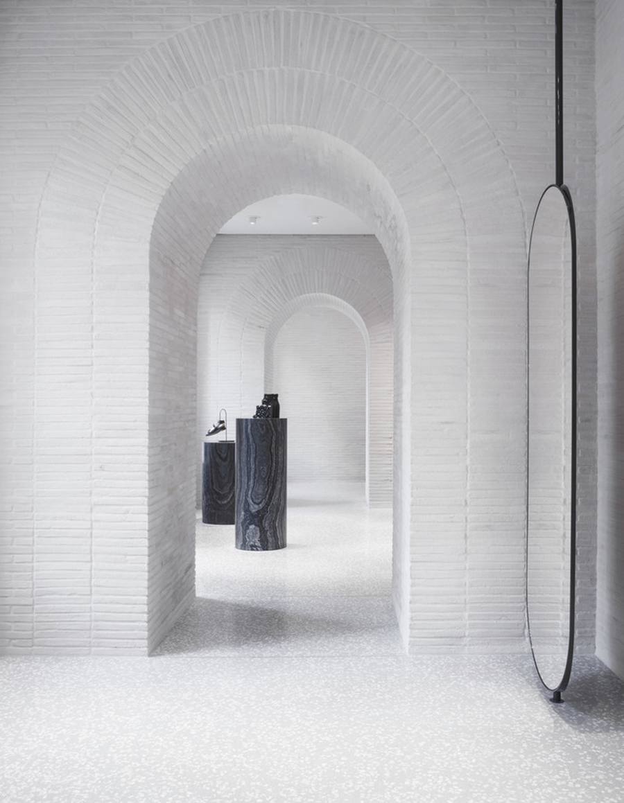
DRAWING FROM…the vernacular architecture of the region, the store’s VIP area hearkens back to the shopping arcades of ancient Rome, echoing their characteristically thick walls, enfilade of arches and long slender bricks. The arch motif is further implemented throughout the store – at once drawing it together and rooting it in the city’s rich historical past. |
Photography by Santi Caleca.


