KNOWN…
for its sweeping seascapes, vibrant arts scene, idyllic old town and daring modern architecture, Valencia is a city of dynamic contrasts. It is also a place of constant renewal, moving with the times without compromising a heritage that stretches back to Roman times. This property, known as Casa BM, is in the Ciutat Vella district, the city’s historic center known for its network of charming pedestrianized streets and iconic attractions such as the mighty Gothic-style Cathedral, 15th century Llotja de la Seda and Art Nouveau Central Market. Located on the top floor of a unique building, the flat was originally poorly compartmentalized, leading to an awkward distribution of light and space. Valencian architect practice Olmos Estudio – a firm known for its linear style and use of pure materials – approached this project by partitioning the home in a totally new way, capturing a tranquil modernism that uses the Mediterranean landscape – its light, its warmth and vast coastal plains – to inform the interior design.
CONTINUING…
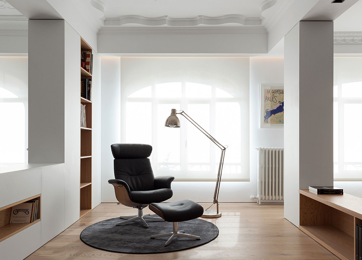
this inherently simple and streamlined aesthetic, the reading area spotlights the classic beauty of an Eames-inspired lounge chair + ottoman and giant Anglepoise floor lamp. A majestic arched window with a gossamer made-to-measure blind, suffuses this section with an ethereal light and marks it out as a dominant central space
EQUALLY…
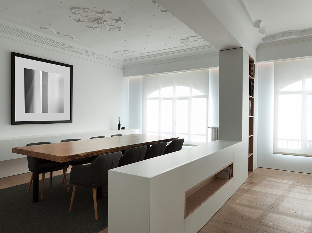
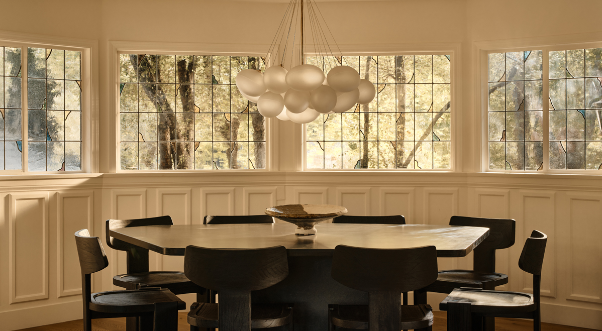
bold and forthright in its design message is the dining area. This is a place to share food and exchange stories – its purpose determined by a large wooden dining table that seats up to 10 guests. You may also note the scarcity of artworks and ornaments, a visual tool that draws the eye to the decorative beauty of the original cornicing and ceiling moldings.
LIVING…
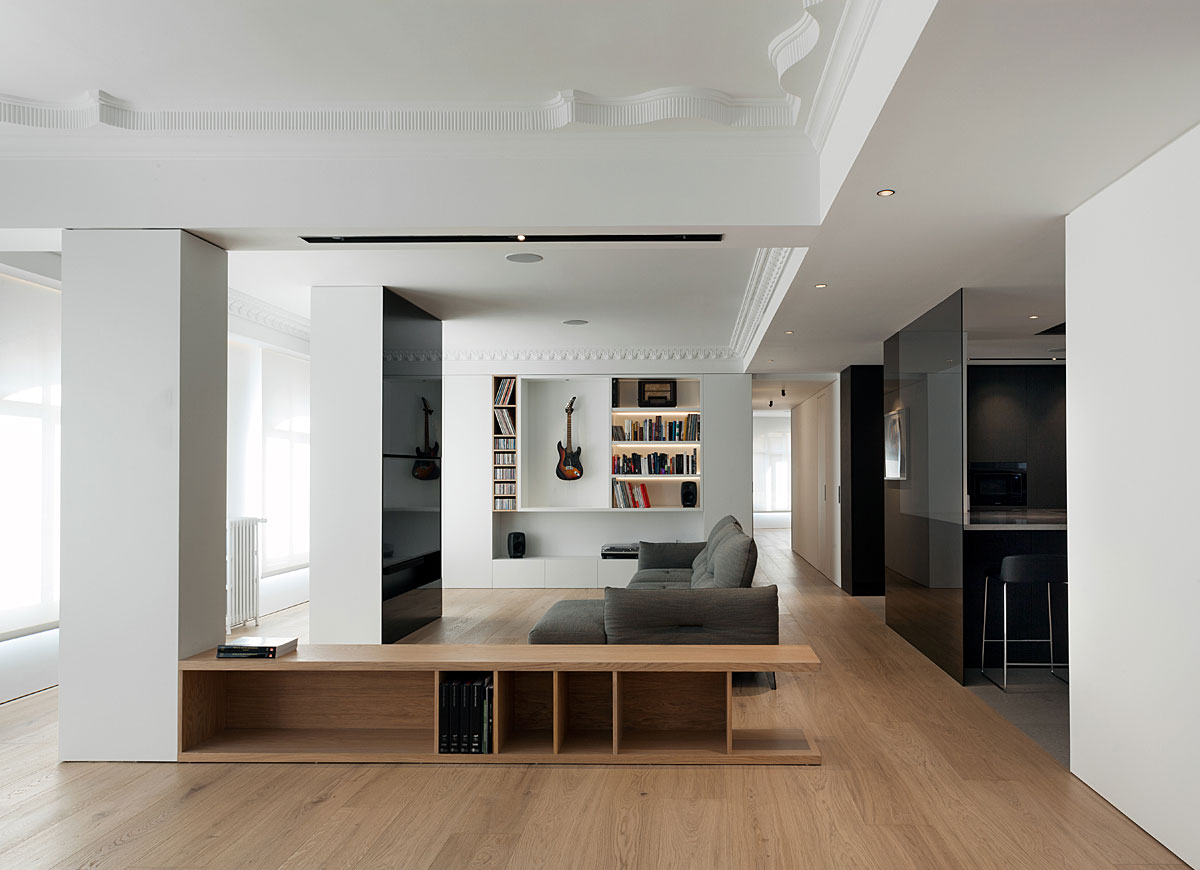
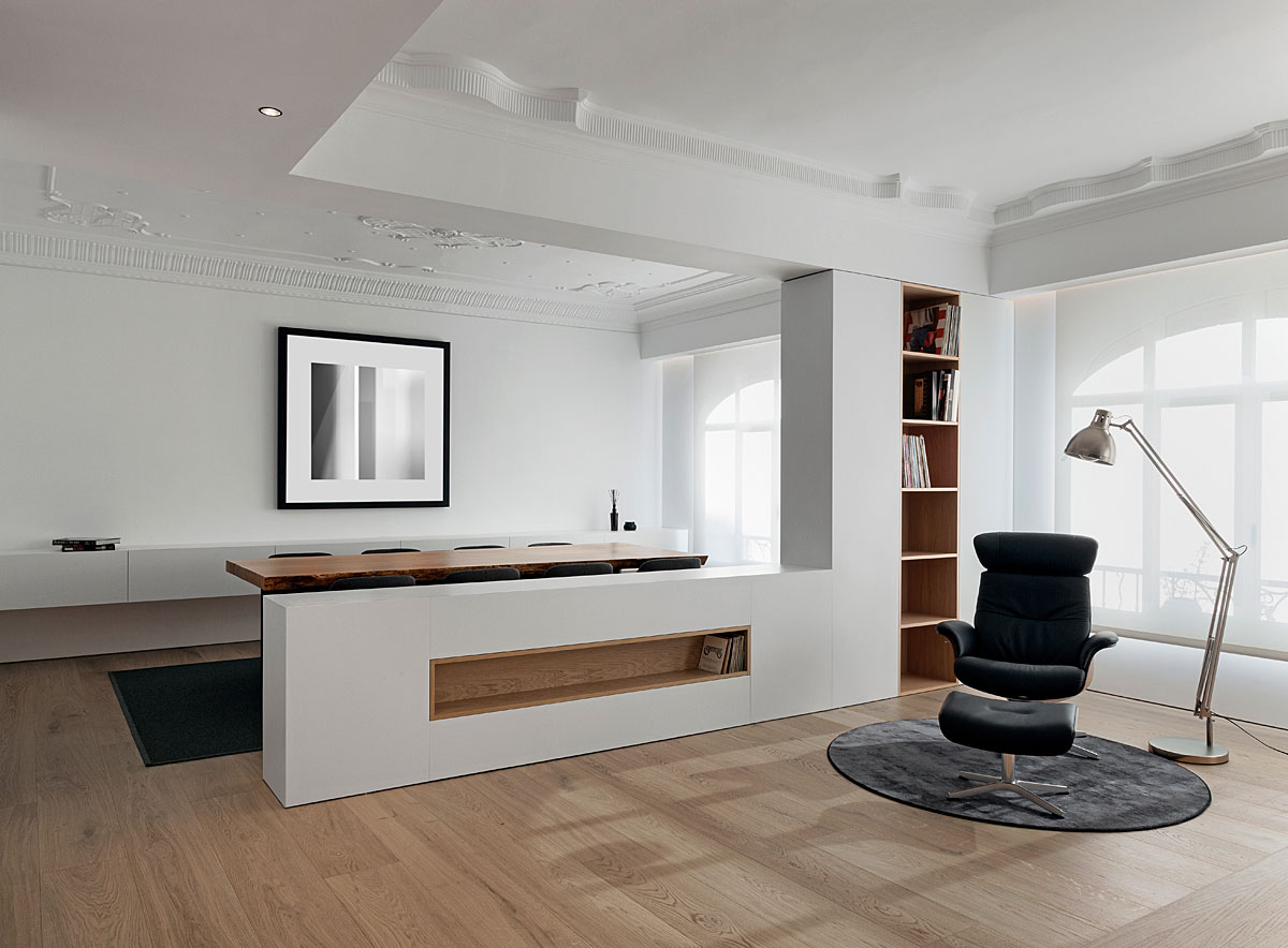
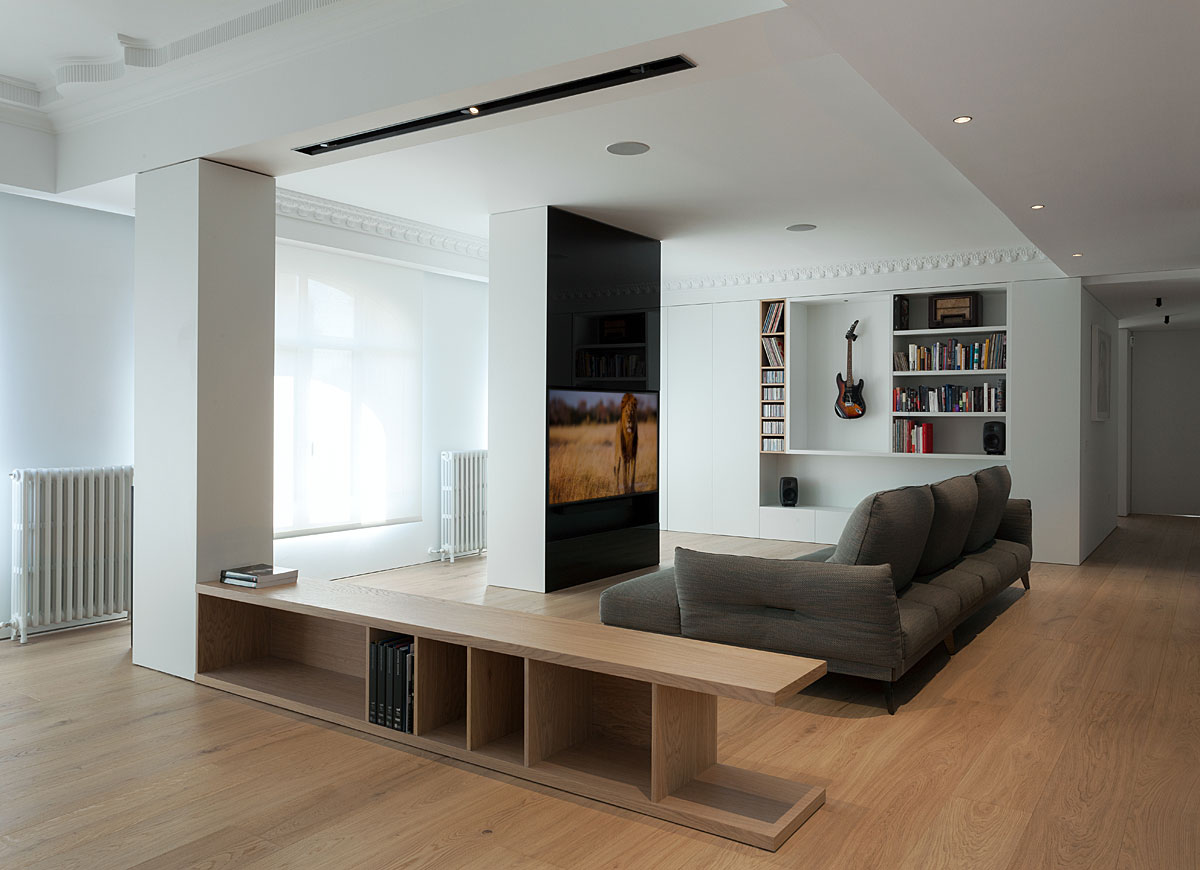
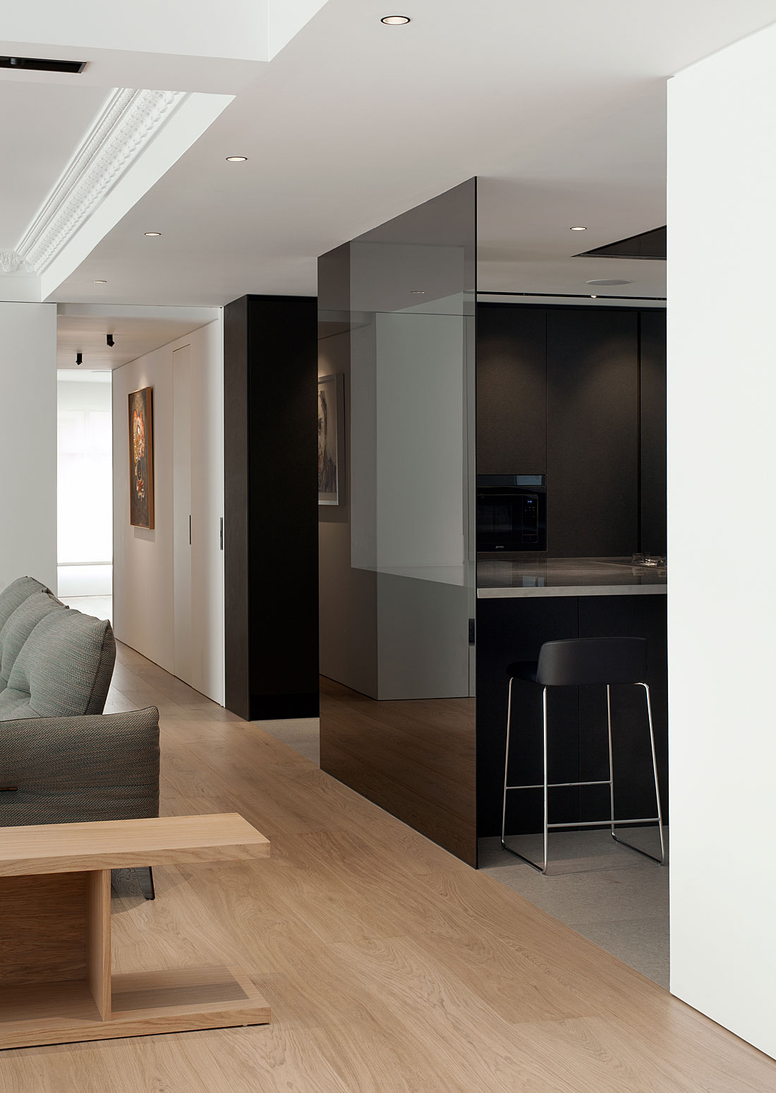
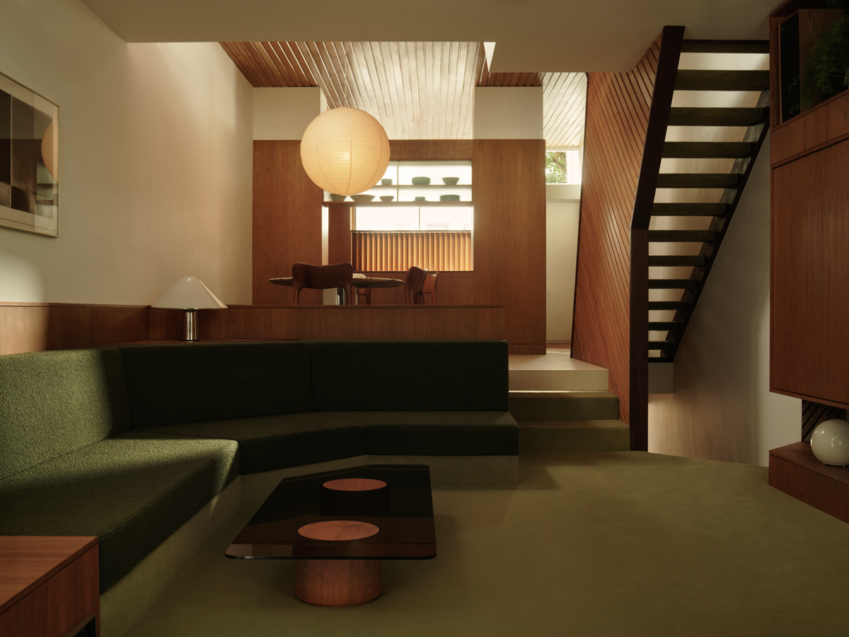
areas are loosely divided into three different zones – a dining room, a reading area and a large lounge – thanks to U-shaped partitions, each equipped with built-in storage solutions that save space in an elegant manner. Structural features are transformed into purposeful design assets – for example, one central column serves as an immersive TV ‘screen’, while a main recessed wall is installed with bespoke shelving for books, decorative objects and a statement electric guitar. This main lounge is dominated by a soft slate-colored Roche Bobois sofa, which perfectly complements the tinted glass wall of a state-of-the-art kitchen.
APPLYING…
a reductive style, the team moved ‘night-time’ spaces to the left of the floor plan so that bedrooms are ensconced in a connective arc. This allowed the architects to maintain the cubic ‘day time’ spaces to the right, astutely leveraging natural light, while explicitly defining viewpoints so that each area retains a sense of privacy.
BEDROOMS…
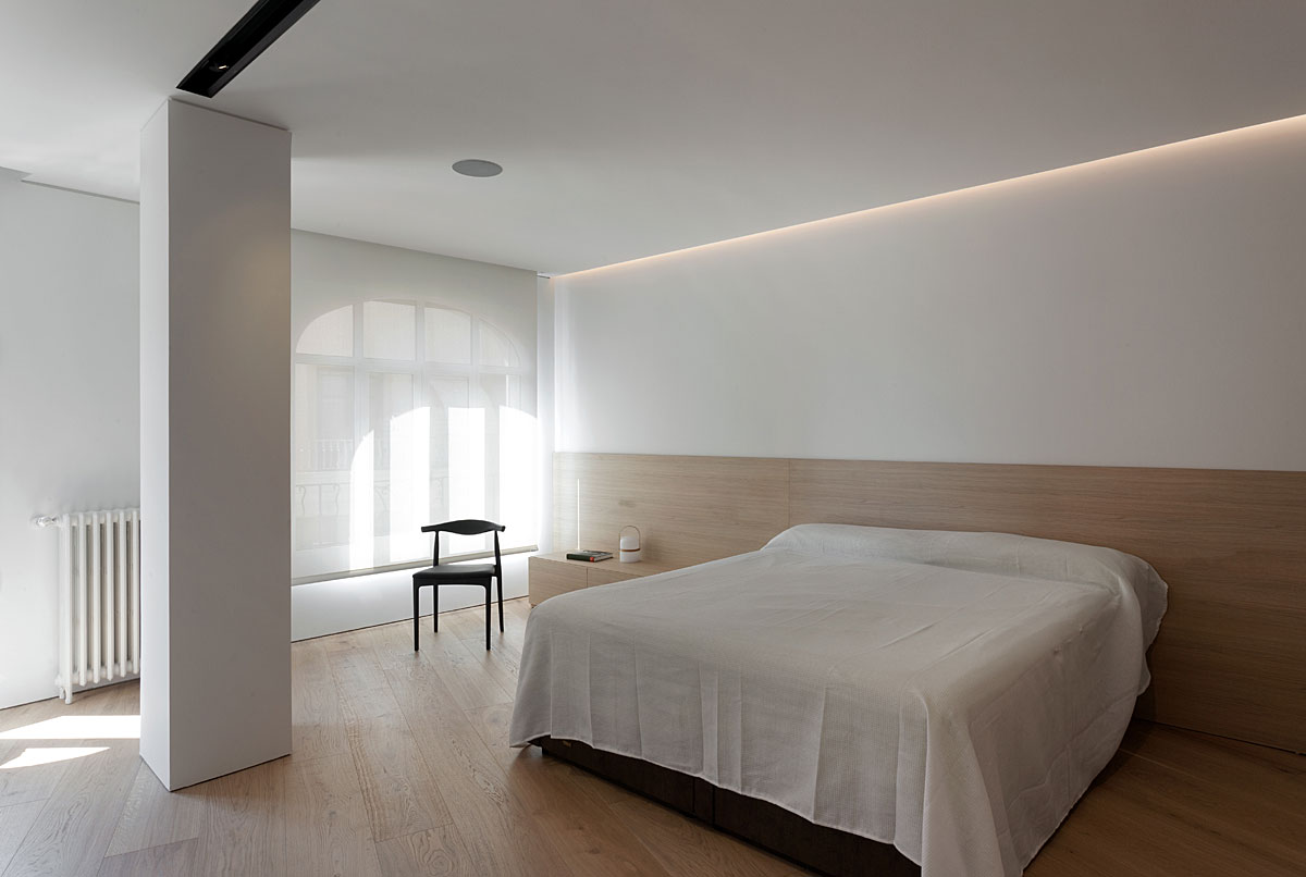
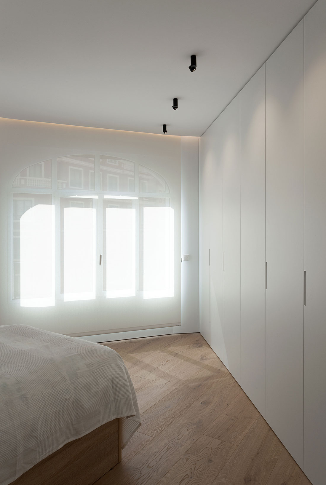
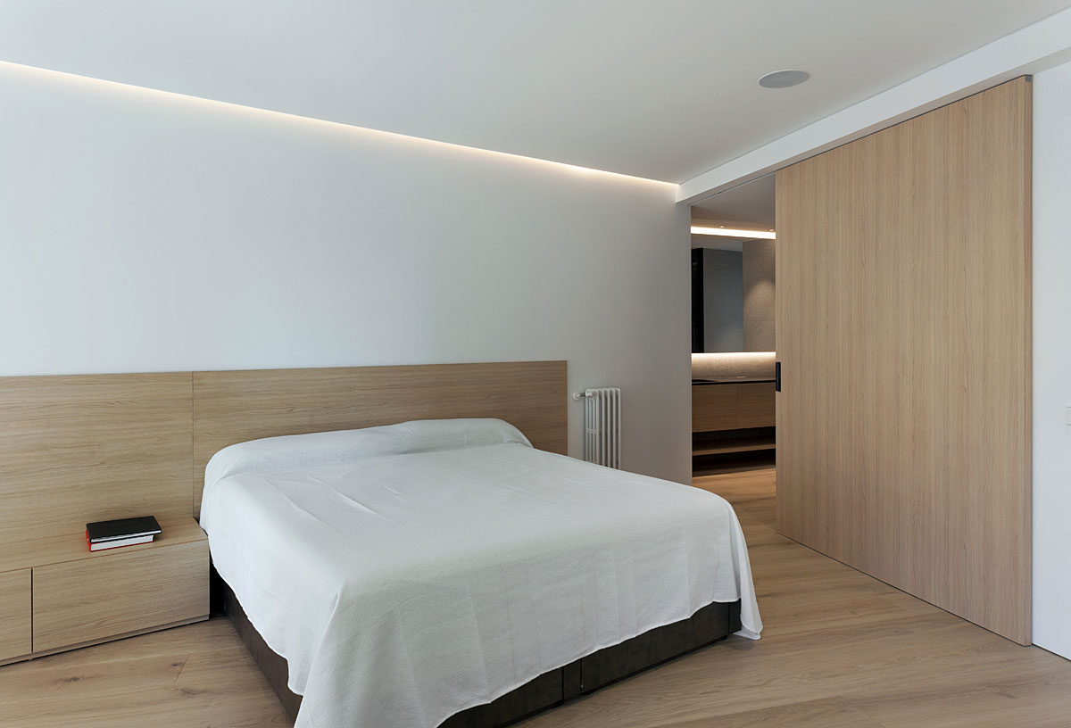
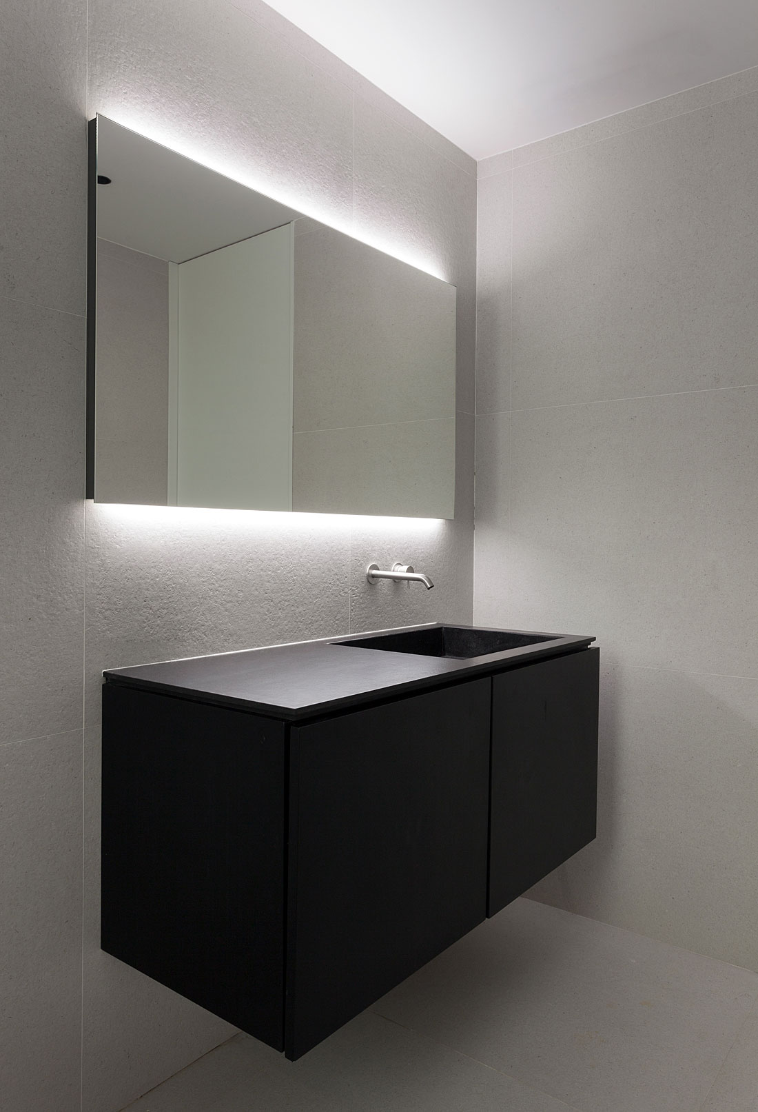
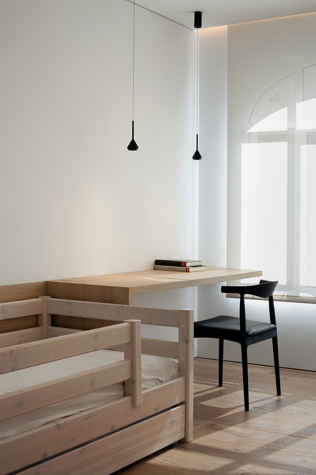
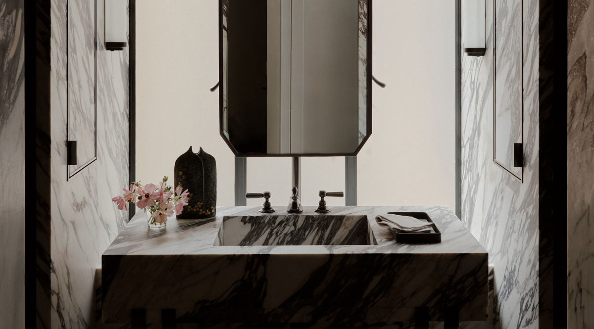
are uncluttered and generously private. It’s minimalism that creates a sense of warmth and comfort here, since an absence of furnishings encourages deep light to travel seamlessly through the wood-clad spaces. Anyone with an eye for detail will appreciate the symmetry and clean lines that unite the varying design elements of this home, be it a sleek bathroom mirror, a glossy cabinet or a built-in cot bed. Every meticulous alignment enhances the overall cohesiveness of this property which triumphs as a well-balanced, immaculately proportioned and restful sanctuary.
Architecture & Interior Design: Olmos Estudio
Photography: Diego Opazo


