In 1961..
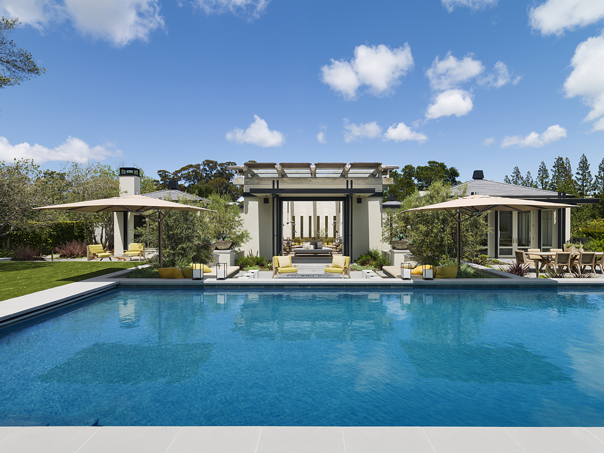
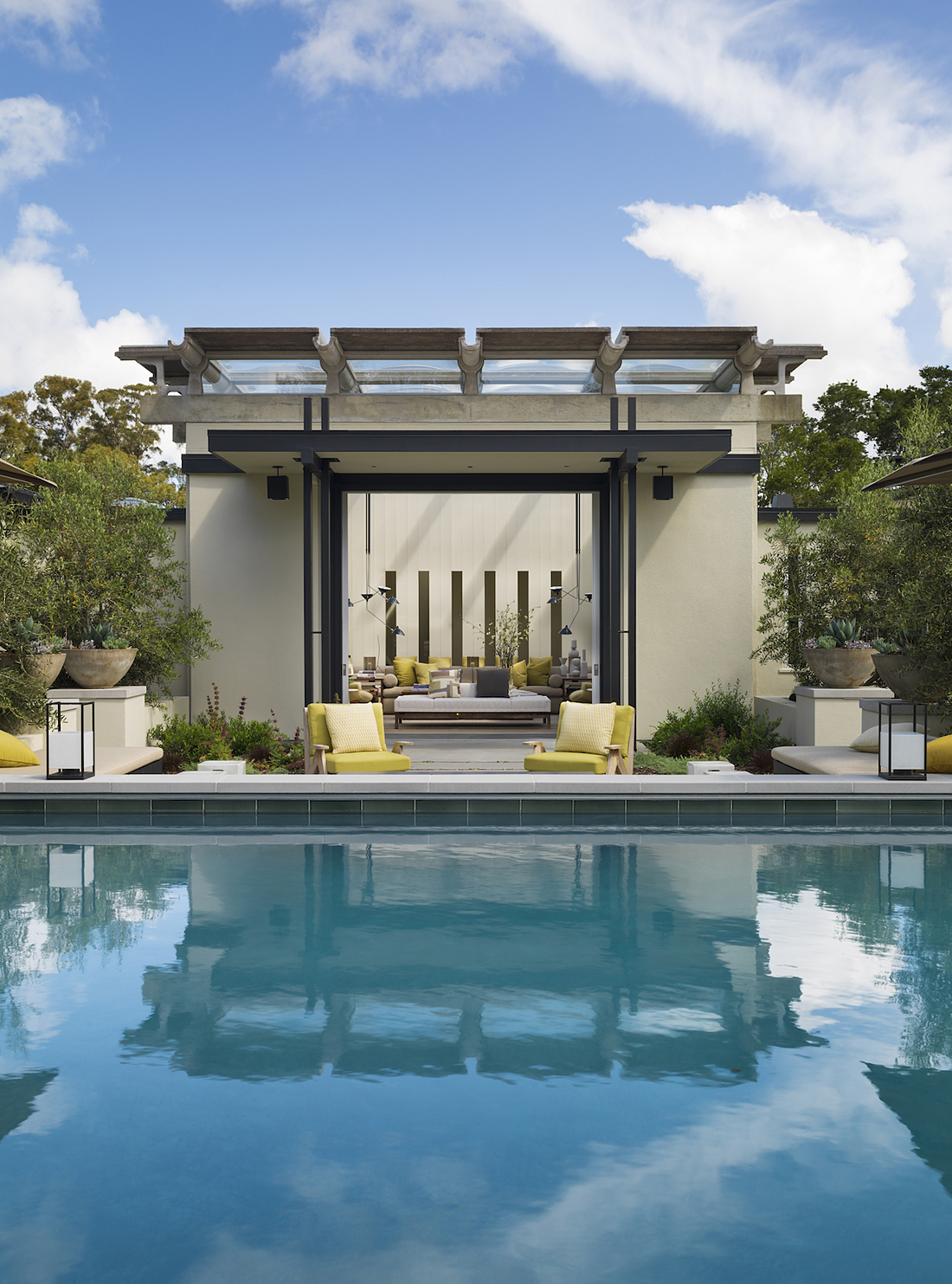
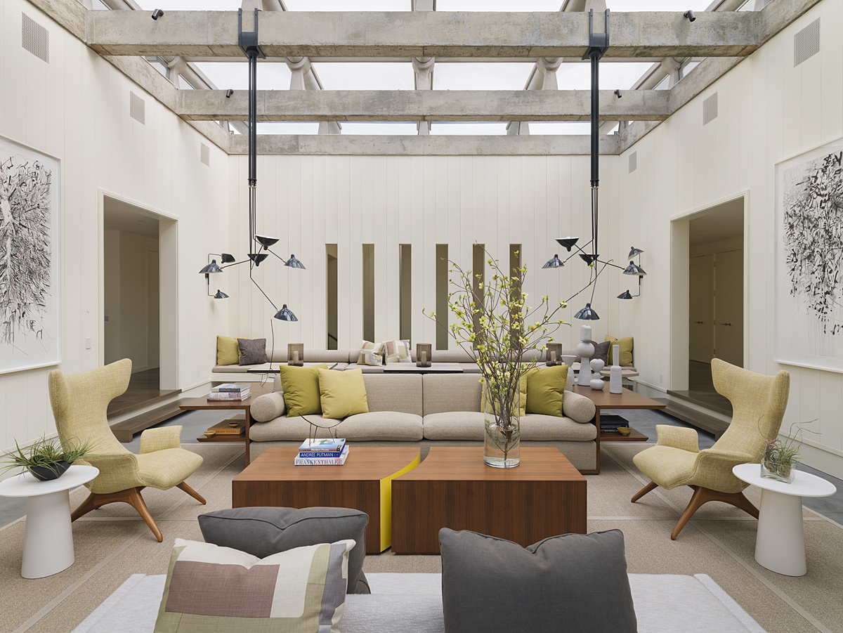
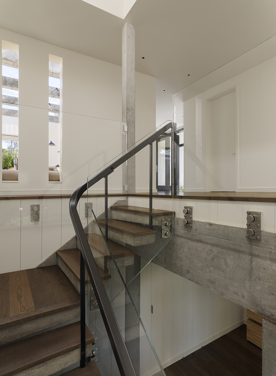
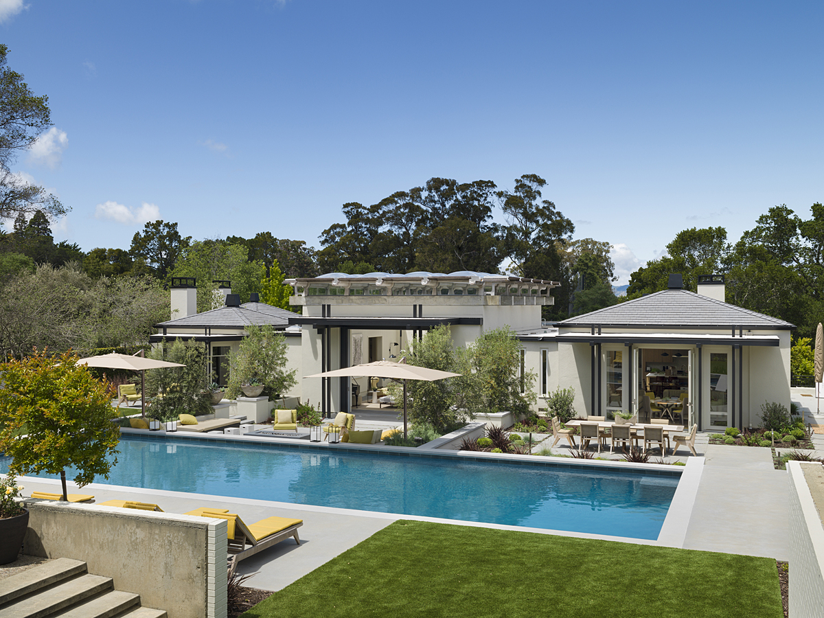
one of California’s greatest residential architects completed a particularly compelling, and confounding, concrete house in the San Francisco Bay area. The celebrated Joseph Esherick (1914-1998) centered the home’s design around a tall, luminous atrium. Overhead, Esherick designed skylights to rest upon concrete beams in a dramatic structural display more typical of a commercial or institutional building. But Esherick’s original client, a midwestern interior designer, eschewed the architect’s open floor plans typical of the era, in favor of a warren of stand-offish rooms. And, as if defying Esherick’s vision, he installed dark wood paneling and elaborate French fireplace mantels, among other unsympathetic features.
Fast forward…
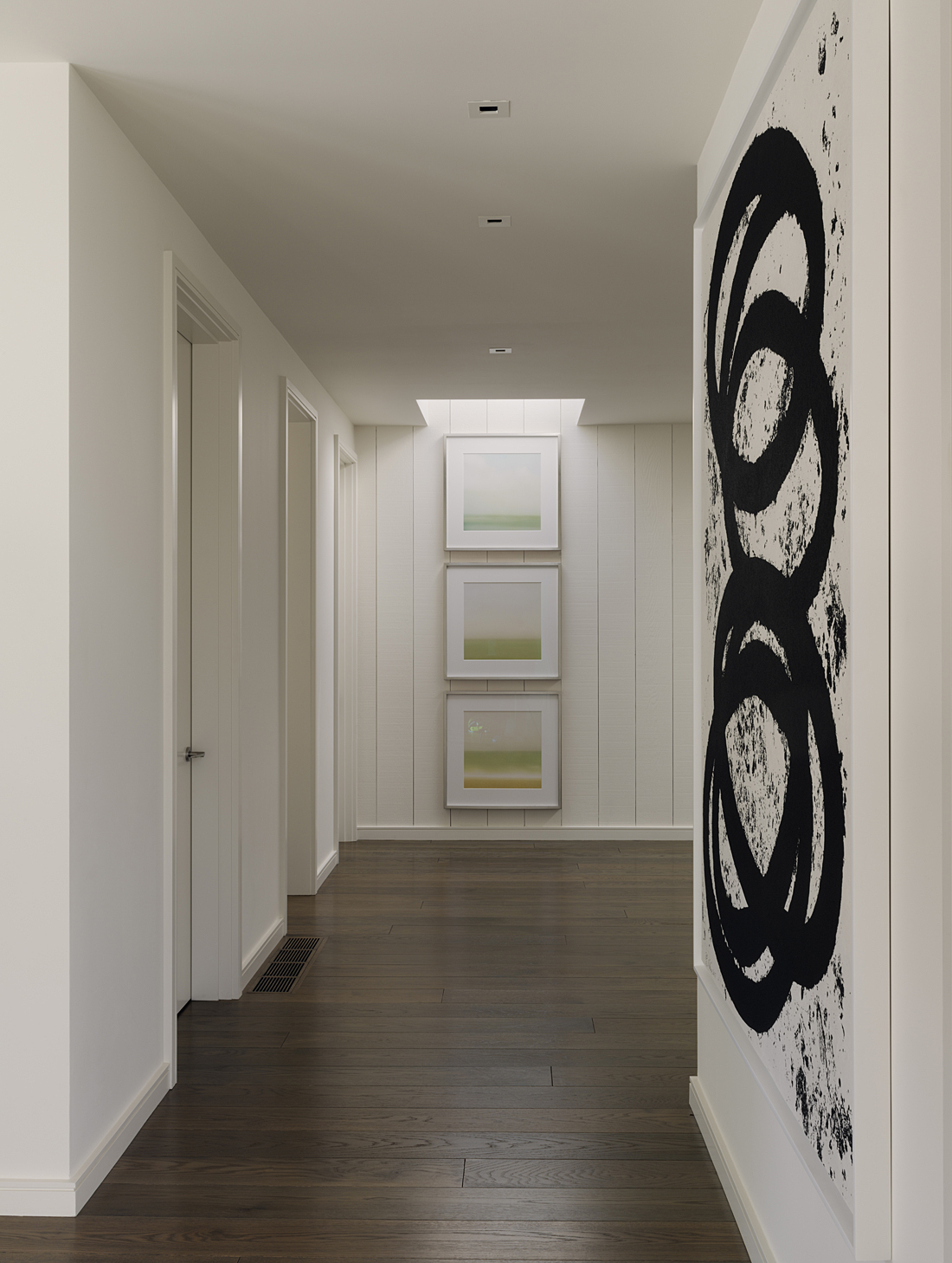
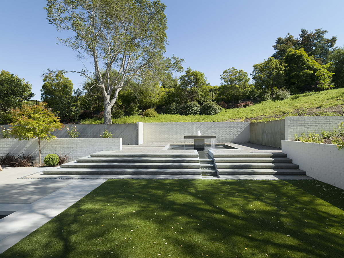
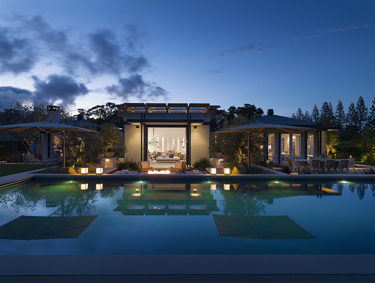
through the decades, the house was recently bought by a couple who saw its unrealized potential. They brought in Bay Area architect Richard Beard and interior designer Paul Wiseman (who had worked with Joseph Esherick on one of his last projects) to find the building’s future in its past. Their goal was to better capture Esherick’s intent by opening up the floor plan, connecting rooms both to each other and to the expansive gardens, which were designed 60 years ago by renowned landscape architect Lawrence Halprin and updated by Todd R. Cole of Strata Landscape Architecture. The result is a house rededicated to mid-century ideals.
Beard had…
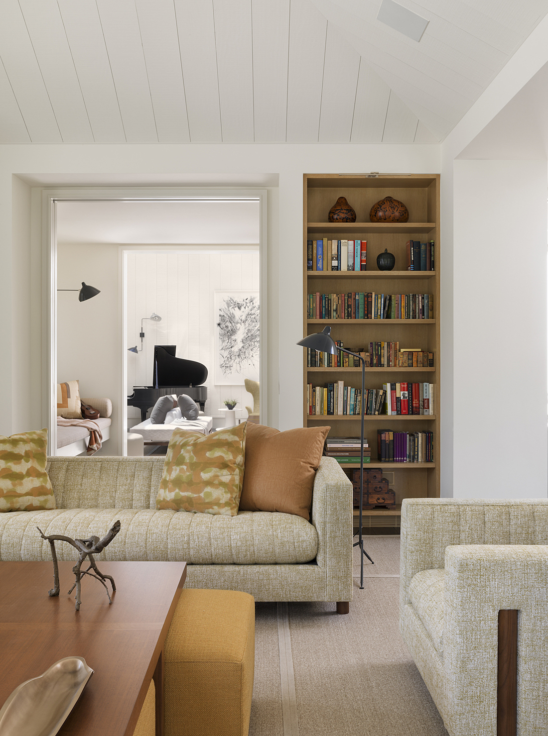
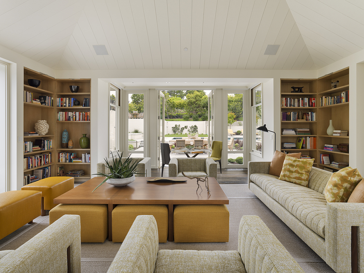
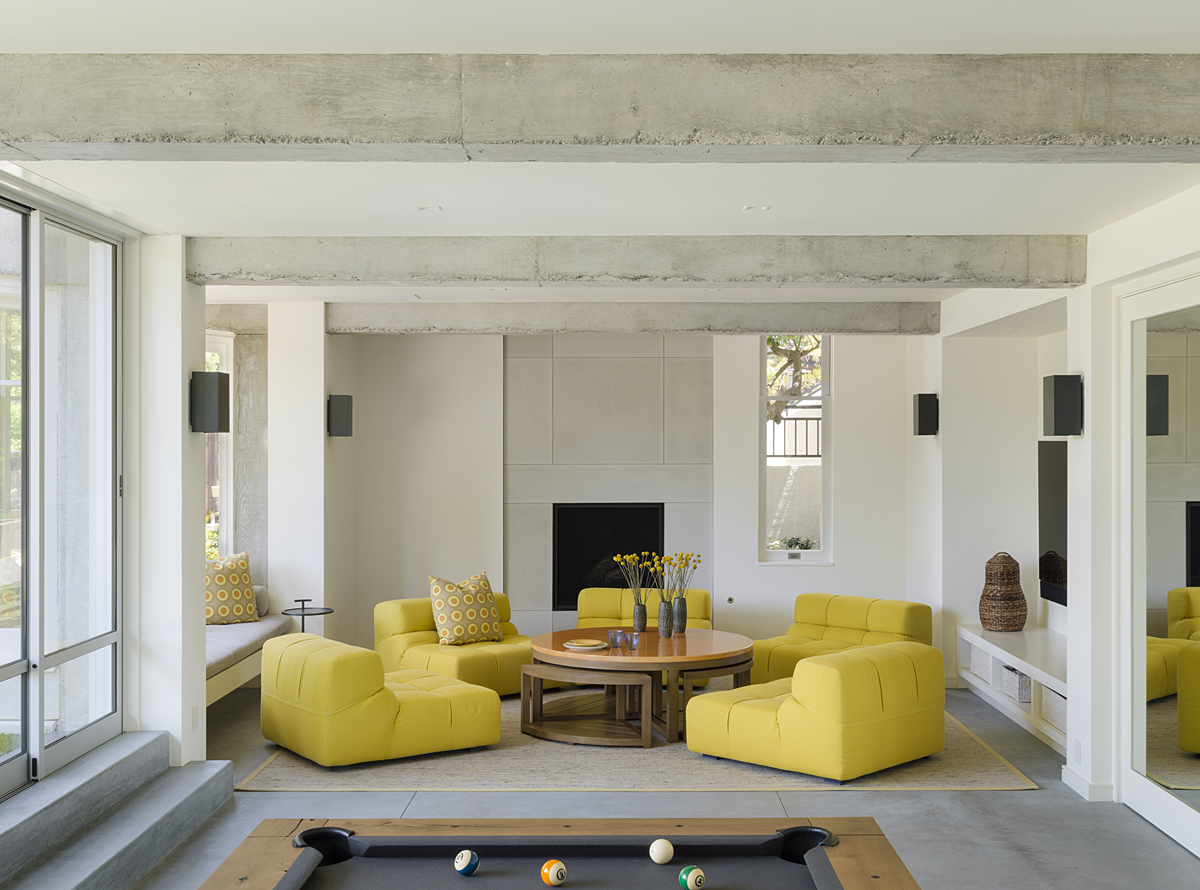
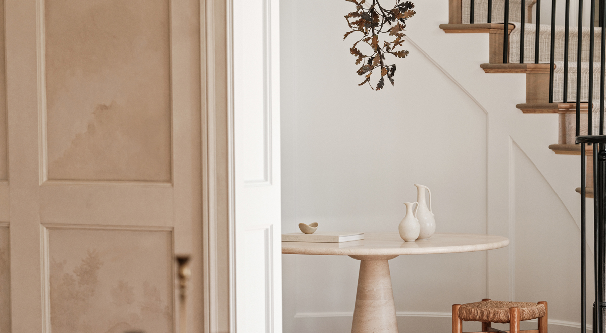
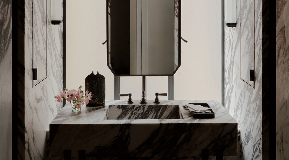
the idea to connect adjacent rooms with vertical-slot openings, emphasizing the verticality of the rooms. Then he and Wiseman replaced busily-patterned floor tiles with sisal carpets from Merida, and applied unfussy Heath Ceramic Tiles to kitchen and bathroom walls. A mix of custom designed furnishings and period pieces, many in shades of yellow, make the rooms pop. Highlights include the cheerful Tufty-Time lounge chairs designed by Patricia Urquiola for B&B Italia in the rec room.
The atrium…
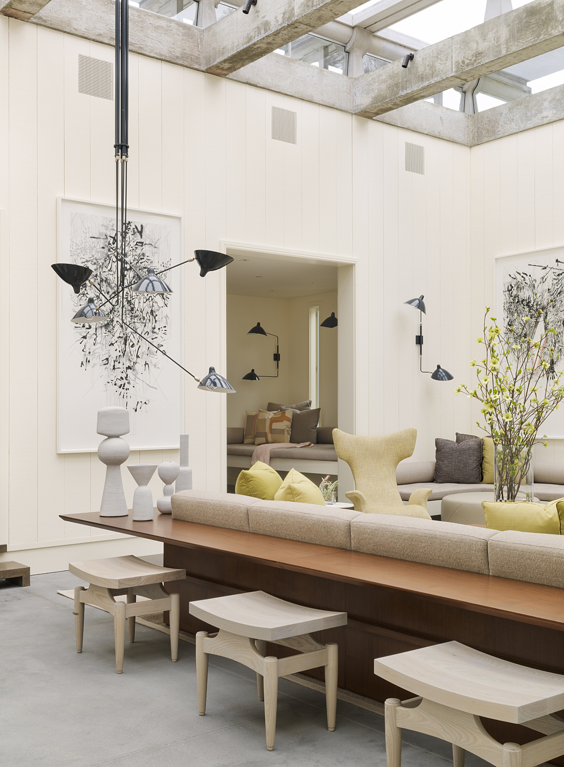
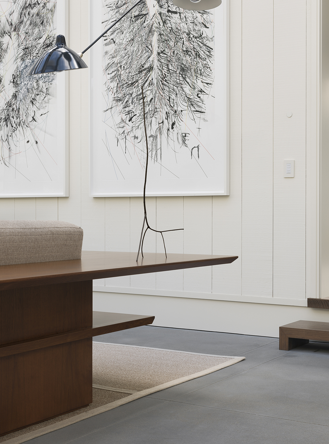
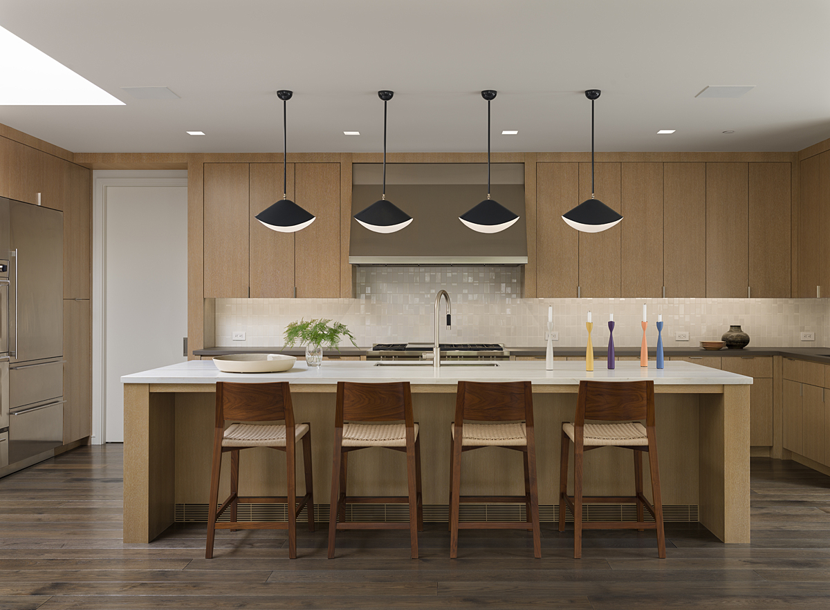
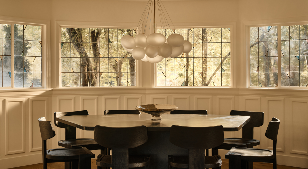
is now divided into zones. One is a living area complete with a pair of embracing Ondine armchairs by the great Vladimir Kagan, along with Holly Hunt side tables and Serge Mouille-style sconces. The other is a dining area with an adjustable-height table under more Mouille-inspired fixtures. The original dining room is now an eat-in kitchen with a giant island (accessorized with Seido counter stools from McGuire and shapely hanging light fixtures from Urban Archaeology).
Newly…
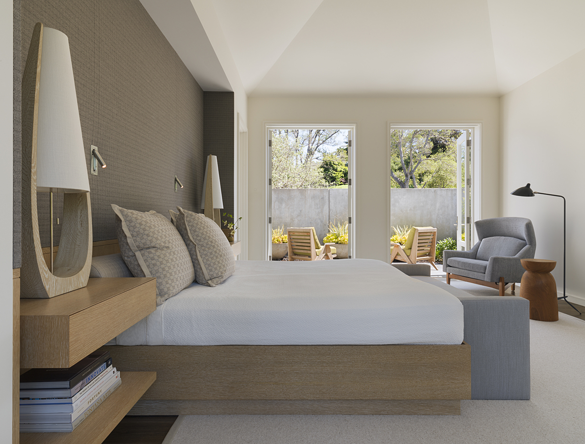
opened up to the garden, the master bedroom features a Jens Risom armchair and ottoman. Even the most private spaces are outfitted with the best of the best. The wife’s dressing room features Danish modern seating and a perfectly scaled Fontana Arte table lamp. Today, the newly revamped house isn’t a period piece, but that’s okay because it was never entirely of its period. It’s an interpretation of what made Esherick, and the architecture of his era, great.
Architecture: Richard Beard Architects
Interior Design: The Wiseman Group
Landscape Architect: Strata Landscape Architecture
Lighting Design: Hiram Banks Lighting Design
Contractor: Louis Ptak Construction
Photography: José Manuel Alorda


