SET IN…
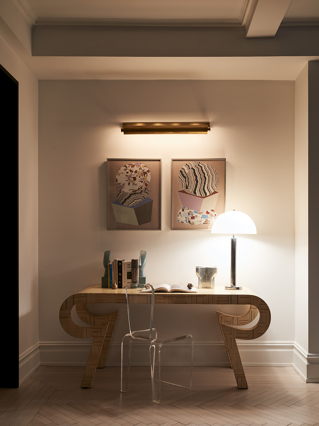
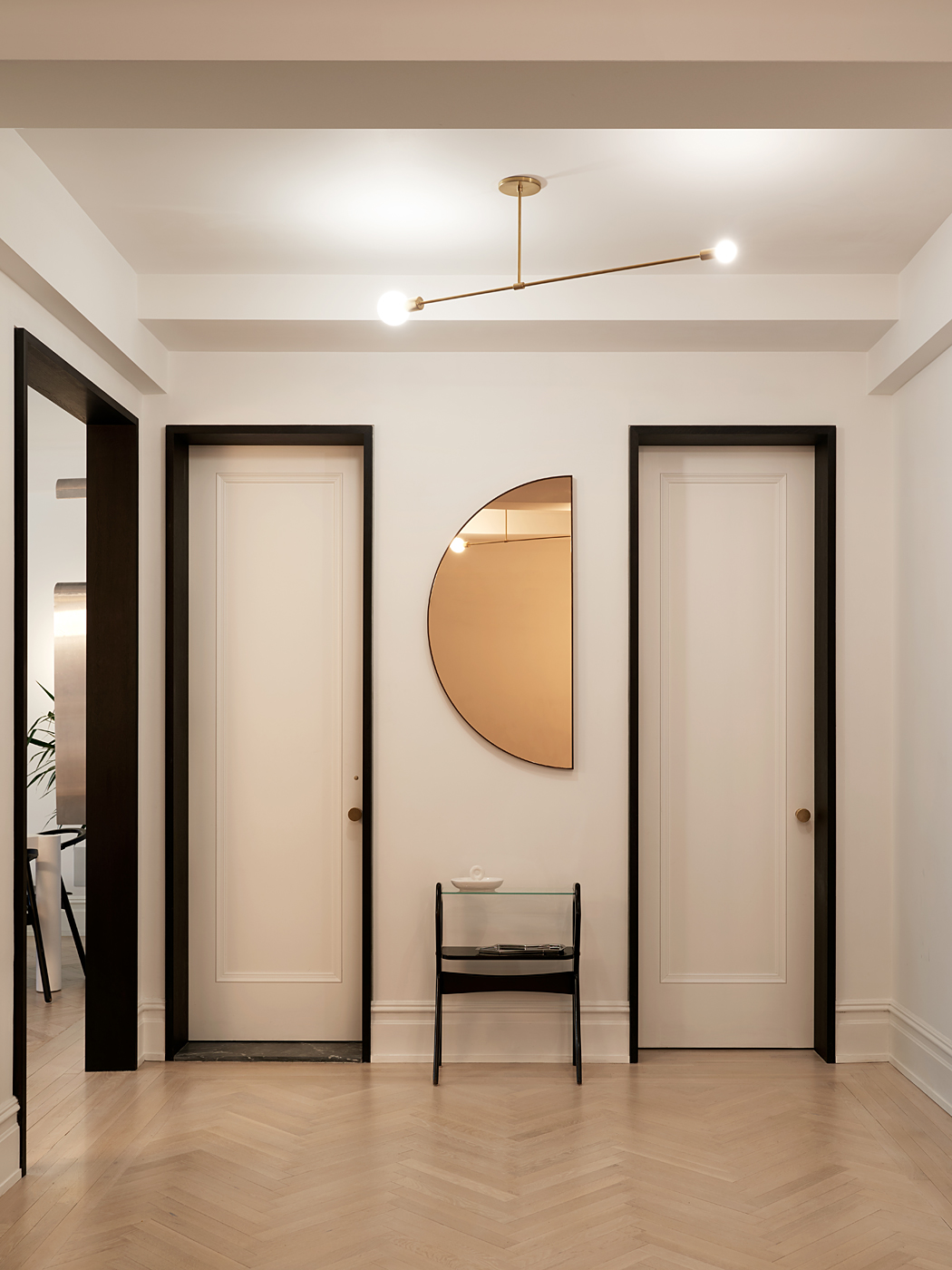
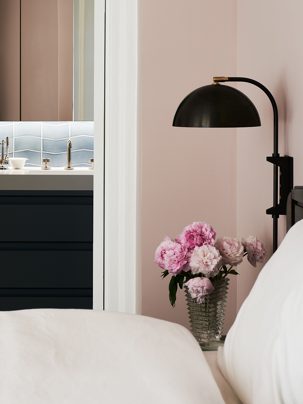
a 2,800 square foot prewar apartment in the heart of Manhattan lies one of Michael K Chen Architecture’s most recent transformations. The covetable Park Avenue property was completely gut renovated and redesigned with a focus on light, flow, and playful details to match its fun loving owners youthful vibe. While the formal spaces were already well proportioned MKCA created an increased sense of expanse by widening points of transition and integrating formerly dark and crowded storage and service areas into the larger functional spaces. The design team furthered a sense of light and flow via a careful selection of well crafted furnishings and finishes working off a neutral base and bringing in bright, whimsical details throughout.
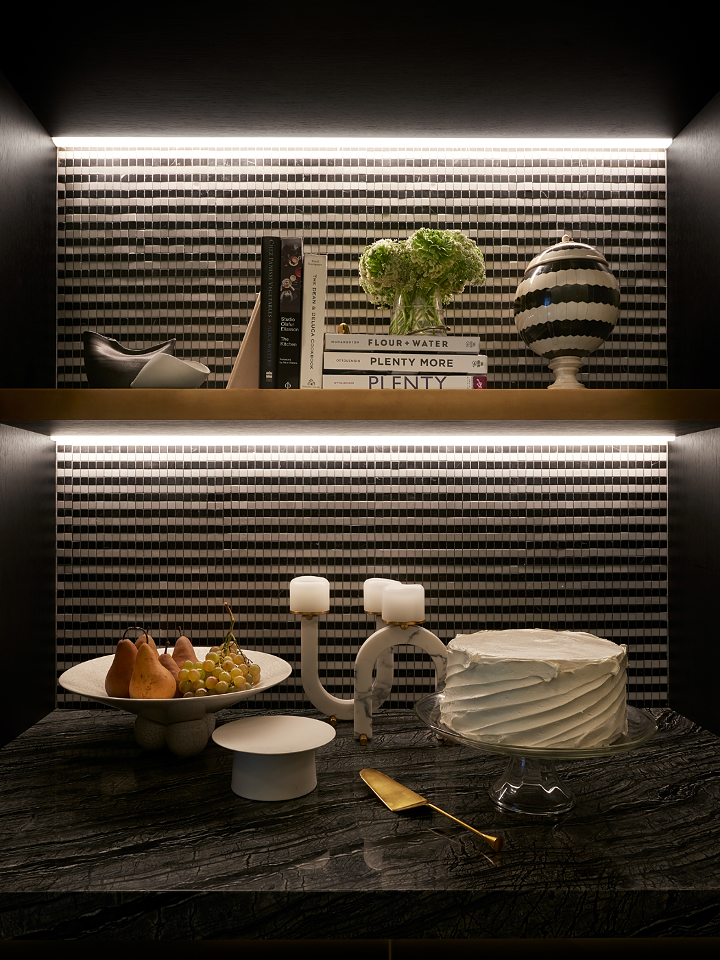
“When we are working in space without abundant natural light, we do everything we can to create a feeling of illumination without having to resort to visible fixtures. Every surface is considered for its properties relative to light. We tend toward contrast in both color and sheen to keep the spaces feeling visually lively, and we make ample use of LED strips that provide focused illumination where it counts.” says firm’s founder Micheal K. Chen.
AT THE…
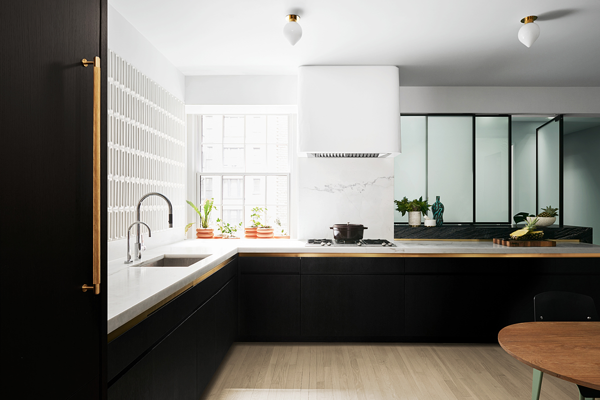
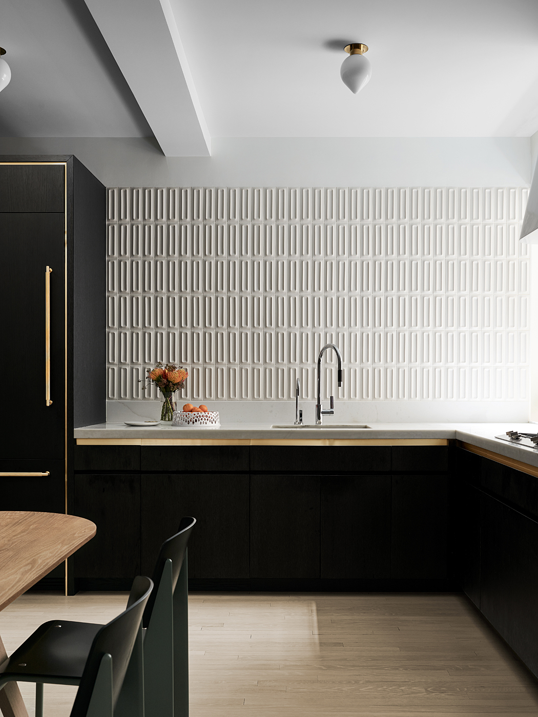
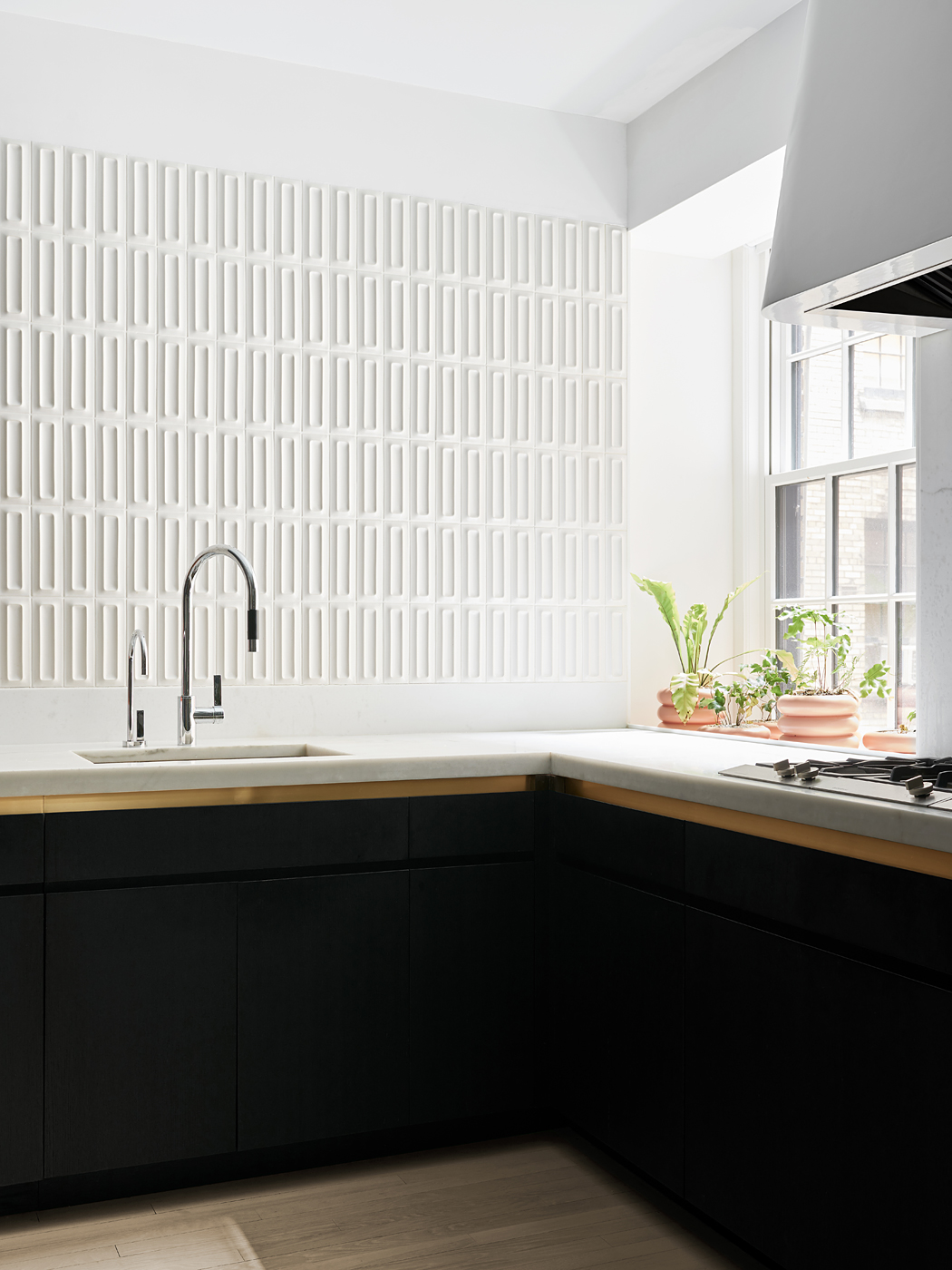
home’s culinary heart, the design team amplified light from a single window with a wall of light-catching tiles from Ann Sacks complemented by iridescent wall paper from Flat Vernacular. In contrast, swaths of custom black cabinetry and a lack of upper level cabinets allow an uninterrupted monolith of white walls and counters to sing. Towards the far end of the kitchen the team accessed a second source of light from an adjacent service entrance via a newly built etched glass punch-out that doubles as a bar when the panels are open.
MKCA TOOK…
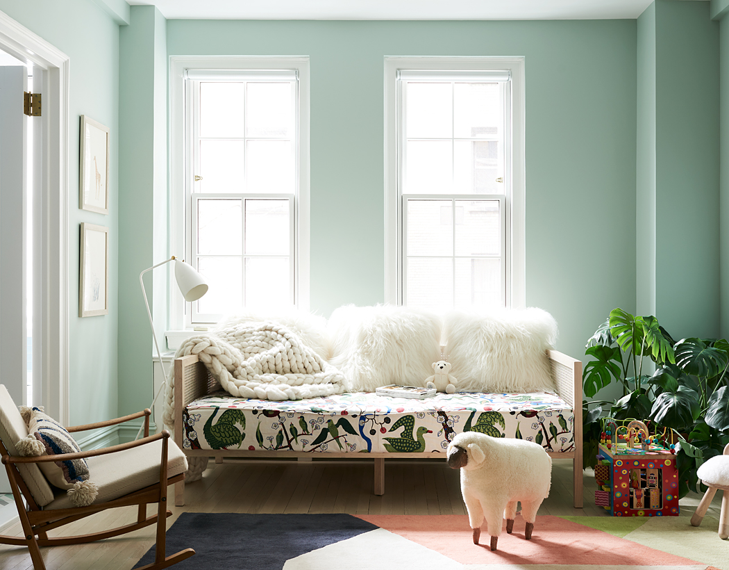
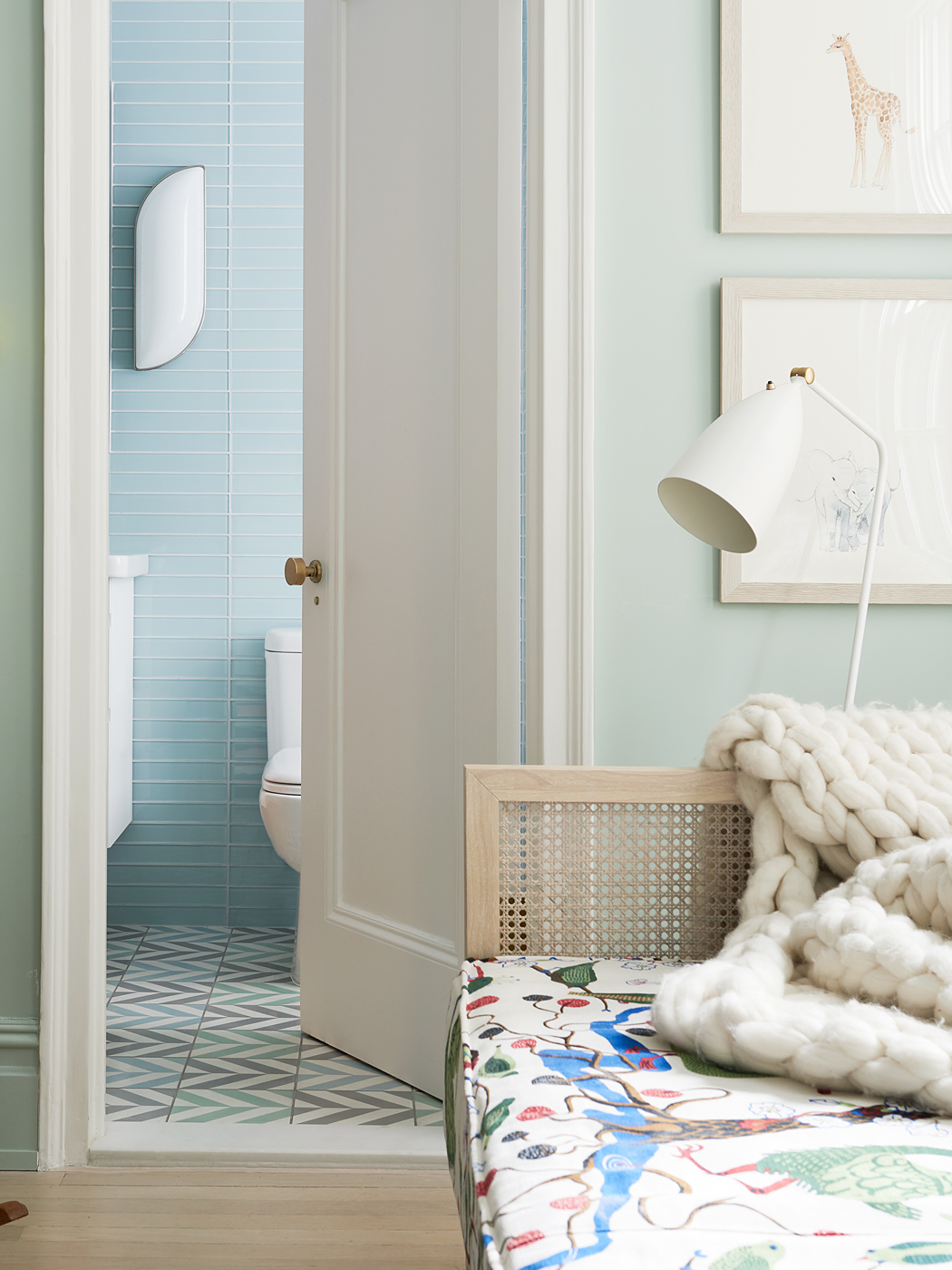
a playful approach to the daughter’s room with an unexpected mix of Scandinavian style and tropical detailing. A simple CB2 daybed enjoys a dose of hygge with a chunky woven throw and Mongolian Lamb pillows. The bed’s graphic seat cushion is upholstered in a Josef Frank botanical print while a small sheep ottoman from Kinder Modern stands guard. Adding a dose of gravitas to the Scandinavian theme are two classic pieces including Greta Magnusson Grossman’s Grasshopper floor lamp and a vintage teak rocking chair by Finn Juhl.
JUST OFF…
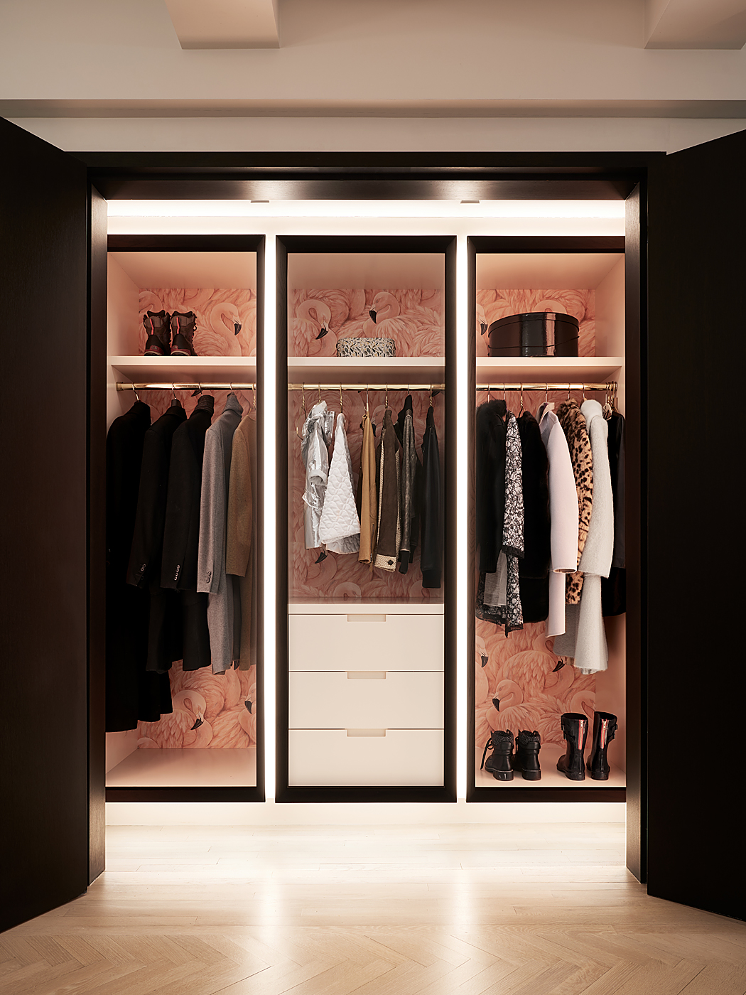
a long gallery residents and guests are met by a large whimsical cloak room framed in dark wood and lined in soft pink lacquer and pink flamingo wallpaper. Integrated LED lighting completes the vibrant space that extends to house strollers, shoes, coats and more.
DESIGNED…
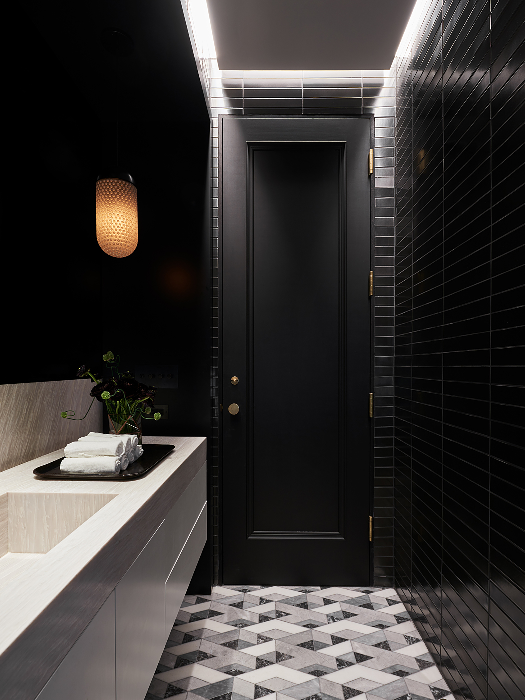
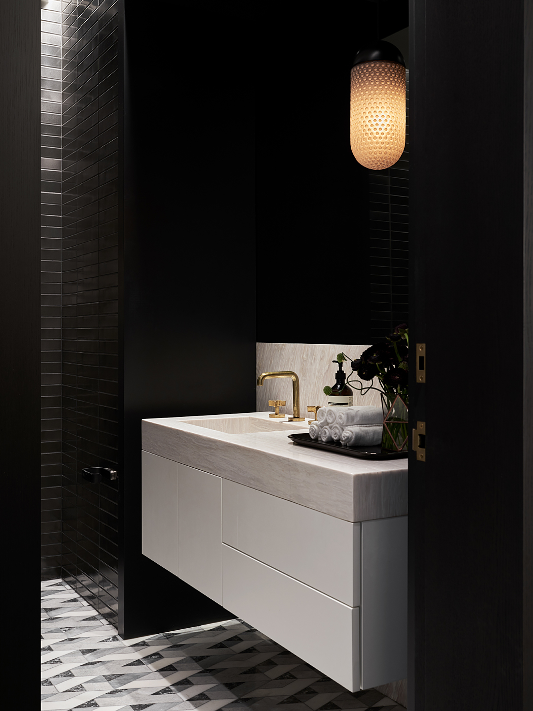
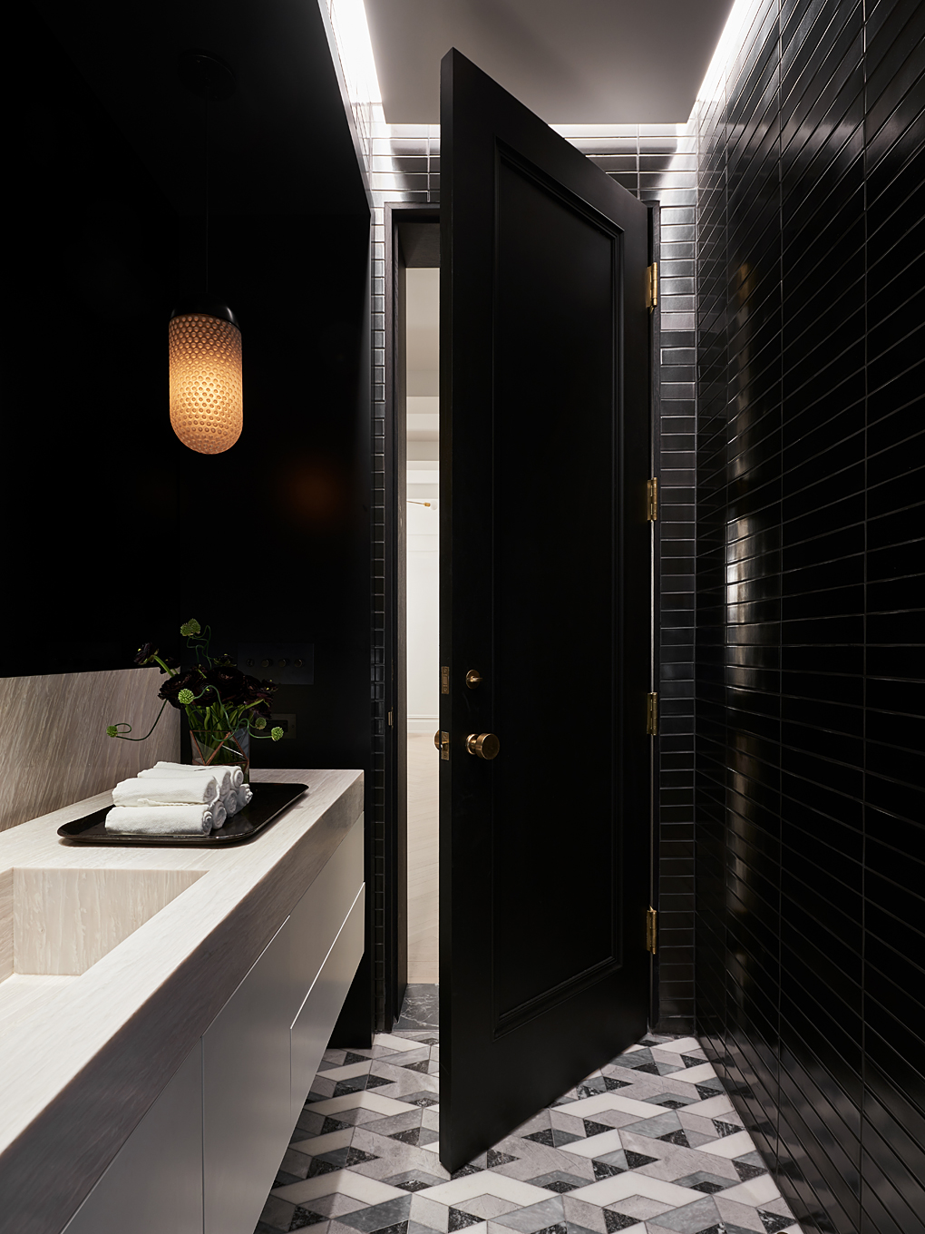
in dialog with the cloak room is an equally dramatic powder room clad in floor to ceiling black metallic tile from Heath Ceramics. Here luxe brass fittings and smoke mirror combine with a dimly lit milk glass pendant – the overall effect evokes a mix of nostalgia for nightclub glamour and grandma’s mid century candy dishes. When it comes to mixing the disparate and unexpected MKCA achieves to delicious effect.
Architecture & Design: Michael K. Chen Architecture
Styling: Cristina Sonneman
Contractor: Think Construction
Photography: Brooke Holm


