SOMETIMES…
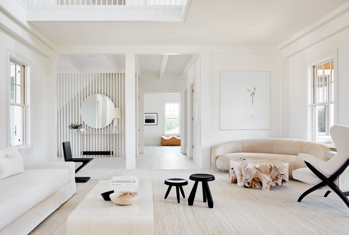
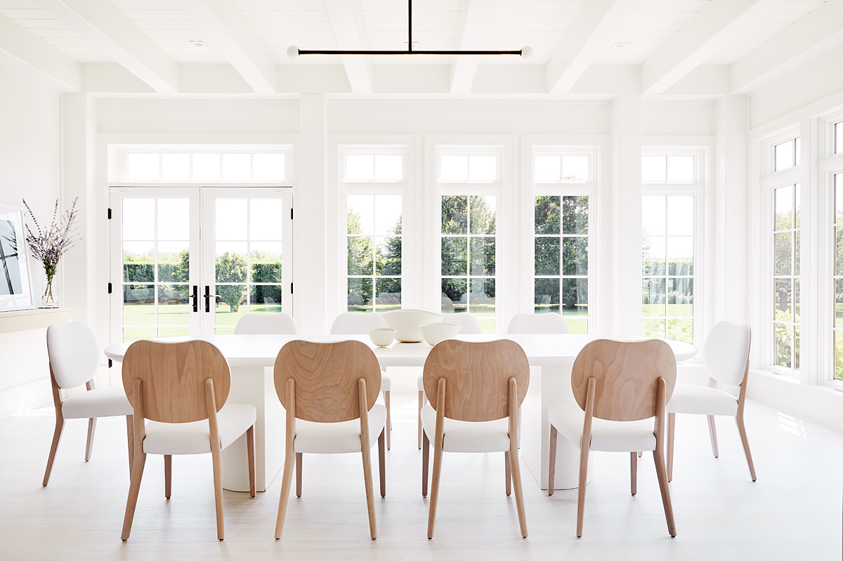
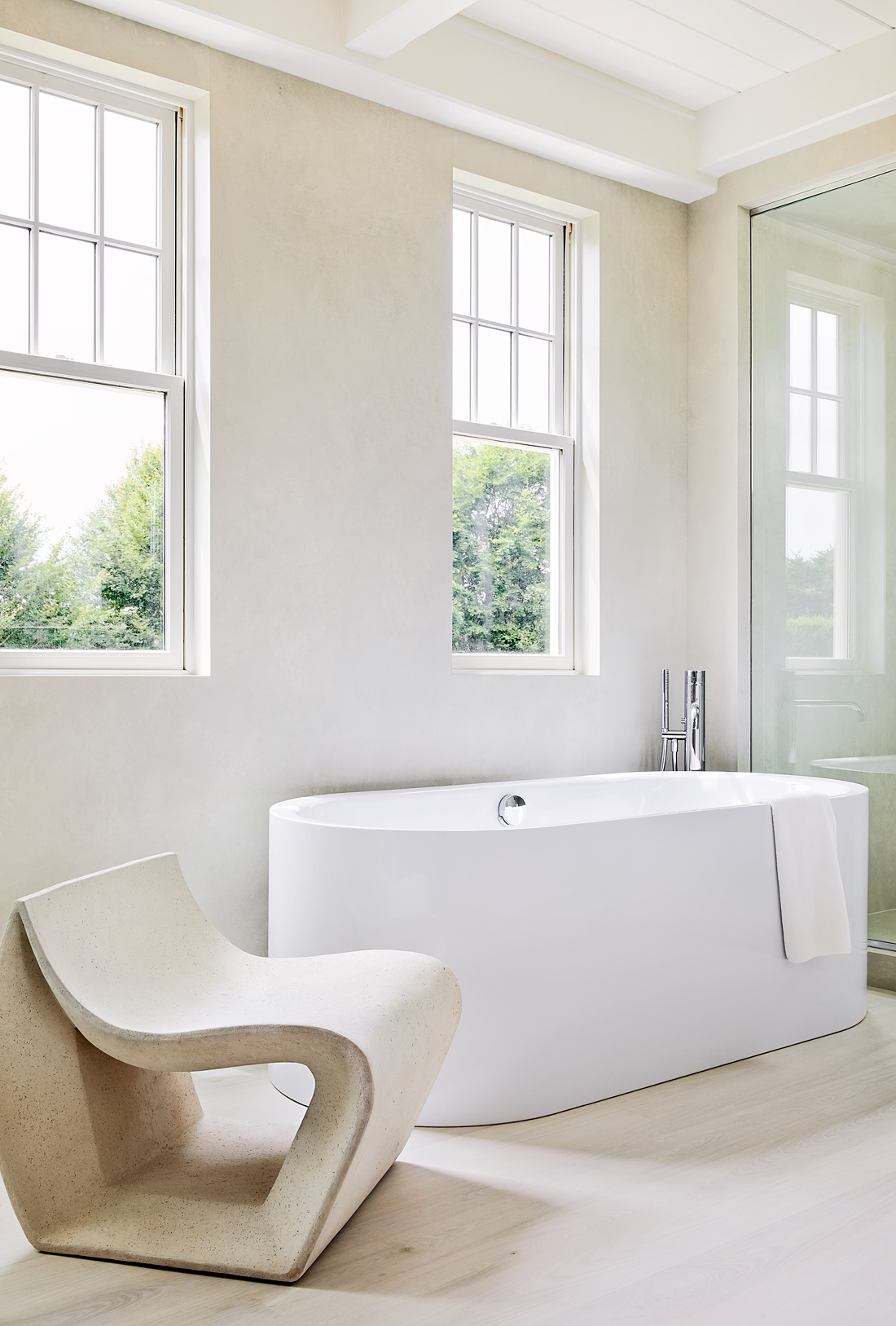
designers push clients, and sometimes clients push designers. When a young creative couple (she’s in fashion; he’s a real estate executive) asked Manhattan’s Workshop/APD to transform a 10,000 square-foot post-and-beam house in the Hamptons, they asked for white-on-white-white interiors. The firm complied, creating a house as ethereal as the inside of a snowdrift. In fact, there is so much white that walls, floors and ceilings blend together like a cyclorama — a photographer’s seamless backdrop.
ITS GABLED…
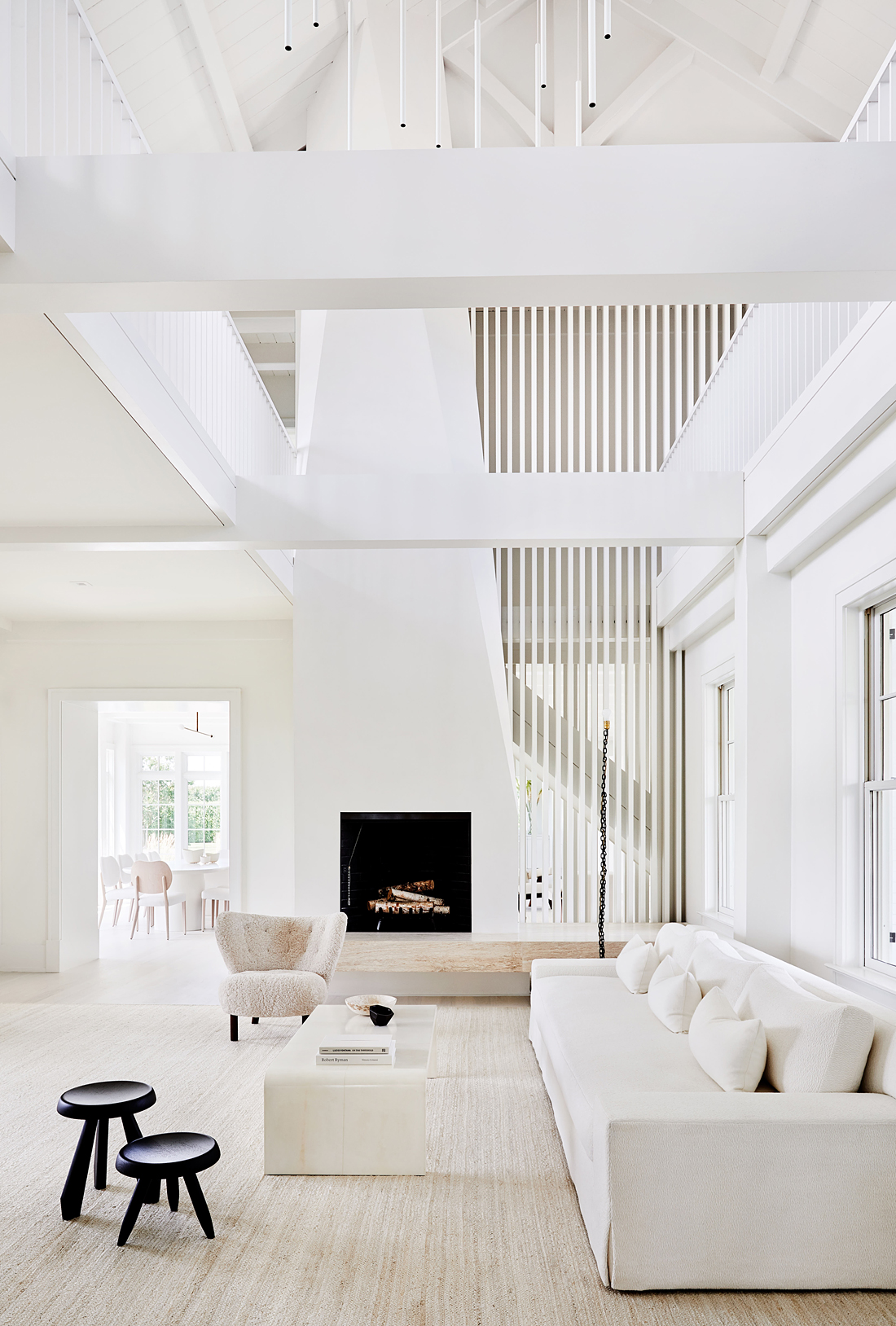
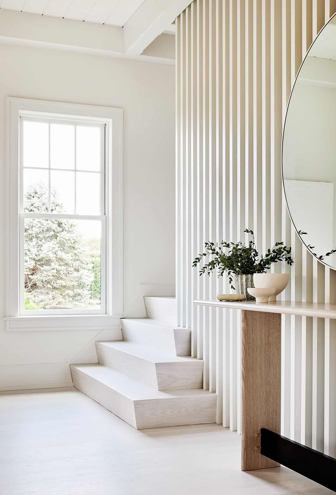
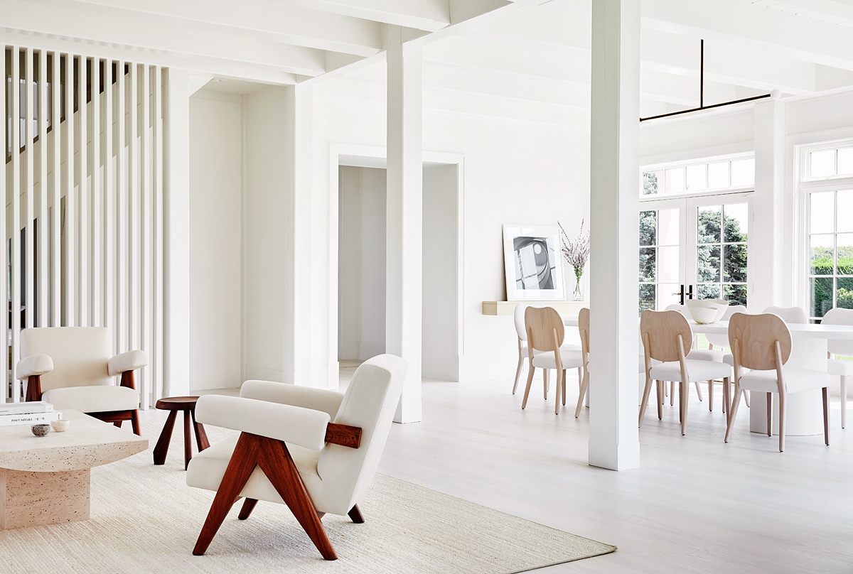
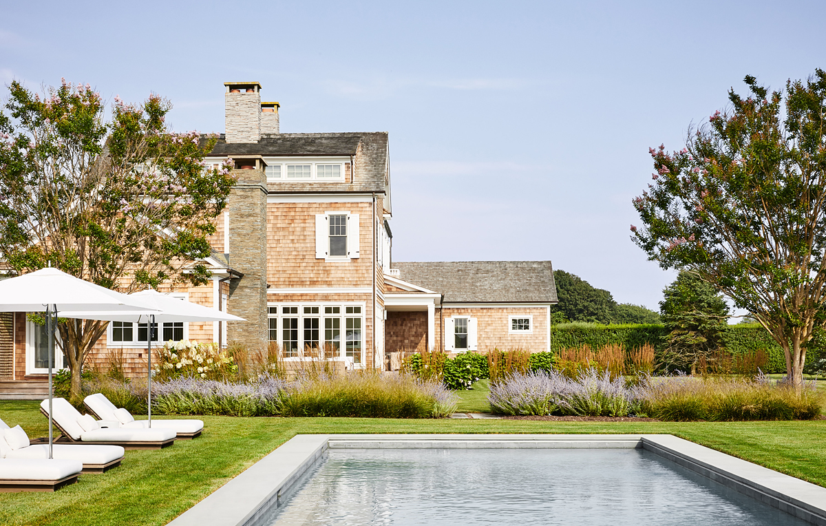
roof, cedar shingles, and stacked-stone chimneys gave the house real character outside. Inside, though, it was chopped up into too many small rooms. “It had no aesthetic, no personality,” says Andrew Kotchen, a founder of Workshop/APD, which was hired as both architect and interior designer of the renovation. Kotchen wasn’t timid. At the behest of the clients, he tore out walls so that the ground floor spaces flowed together as if in a SoHo loft. And then he cut through the living room ceiling to create a dramatic 28-foot-high space. Walls hiding a pair of staircases were replaced with vertical slats of wood, painted white, giving the spaces beyond some privacy without severing sightlines. And an existing masonry fireplace was rebuilt as a soaring sculptural element that leads the eye all the way to the vaulted ceiling.
THE RENOVATION…
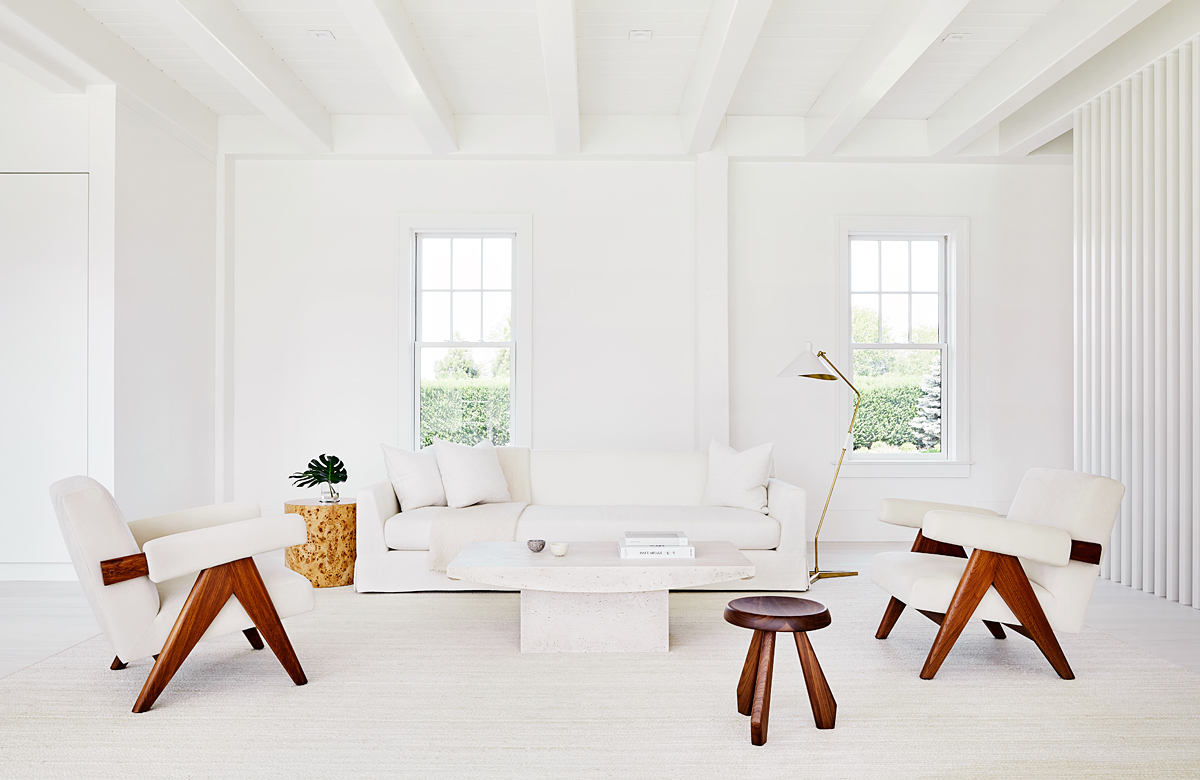
exposed some of the original posts and beams, but like everything else they’re painted white, so the effect is hardly rustic. Floors throughout the house are pale washed oak and carpets of ivory colored jute, about as close to white as a family with two young sons can get. Given the backdrop, anything that isn’t white takes on particular importance.
THE CLIENTS…
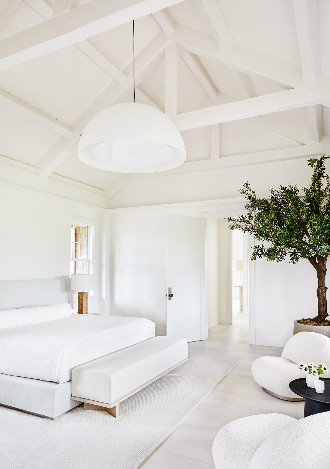
asked Workshop/APD director of interiors Michael Ellison to use as few pieces of furniture as possible. That meant each piece had to have an impact. In the family room, a pair of scissor-leg chairs by Pierre Jeanneret and stool by Charlotte Perriand make strong impressions. In the dining room, a barely-there chandelier from Allied Maker hangs above a custom table and a set of Livoni Adelaide dining chairs. Their heart-shaped wooden backs are the most graphic items in the room. In the master bedroom, a pair of 1970s Pierre Paulin Pacha Lounge Chairs round out the space.
GOING FOR…
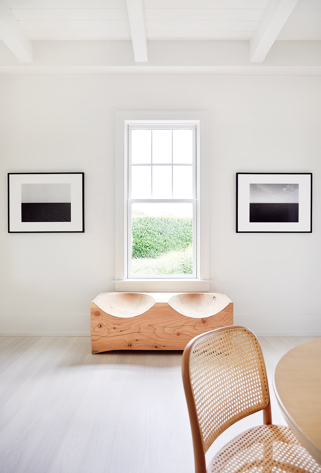
quality not quantity, Ellison created handsome vignettes of standout pieces. One window, looking toward the ocean, is flanked by a pair of seascape photographs by Hiroshi Sugimoto. Below the window, a log bench has the primitive appeal of driftwood. Like furniture, art is both spare and used sparingly; contemporary pieces by the likes of Jean-Michel Othoniel and Harmony Korine are decidedly monochromatic. Even the landscape designer got in on the act: although there are sea grasses and beds of lavender around the pool, the most prominent flora are white hydrangeas.
Interior Architecture & Design: Workshop/APD
Photographer: Read Mckendree


