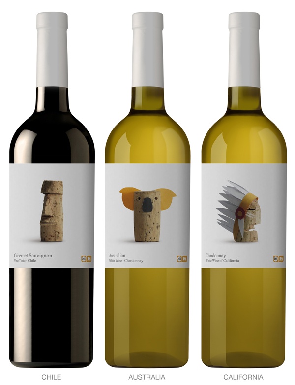
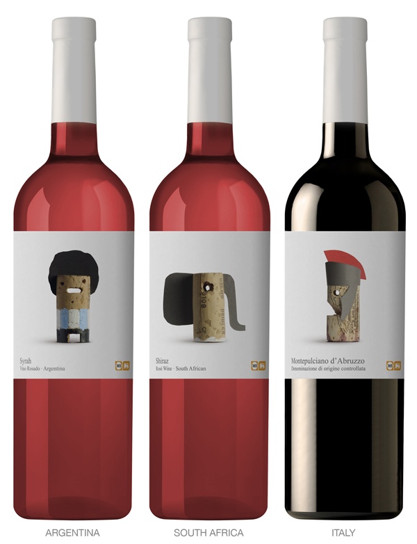
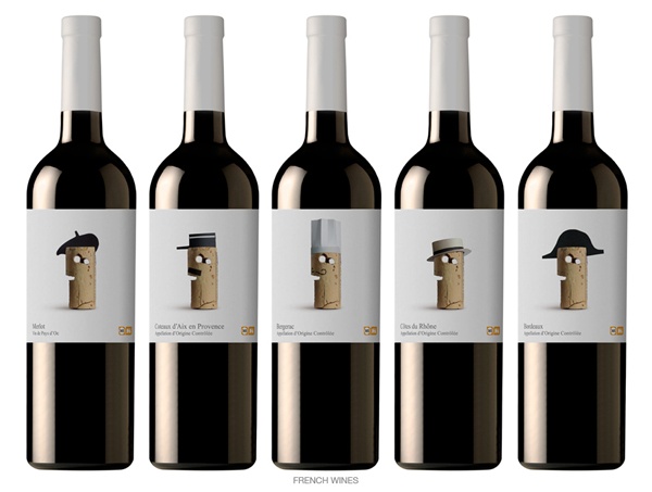
Wine buying anxiety be gone! Call me unsophisticated or shallow but with packaging like this, price and quality concerns are almost out the window. After all, what host would not love to receive a bottle of wine as adorable as the ones shown here?
So how did all this wine label fantasticness come about? It all began a couple of years ago when the Belgium supermarket chain, Delhaize approached the multi award winning Lavernia & Cienfuegos Design firm with the task of creating labels for their “365” brand of wines. The primary goal – to create a simple and unified look for the affordable “365” brand while imbuing it with a sense of humor. With thoughts of an everyday wine in mind, the designers chose an ingenious if not obvious muse – the ordinary cork which they then whittled and dressed according to each wines location of origin. The result – Chilean corks carved into miniature moai, Californian corks transformed into noble Native Americans and free wheeling cowboys, French corks designed to don tiny Napoleon hats, berets and so on.
Job well done Lavernia & Cienfuegos! Click here for a Delhaize location near you. Now I’m off to see if it’s possible to get my hands on some of these bottles.
Images courtesy of Lavernia & Cienfuegos Design.


